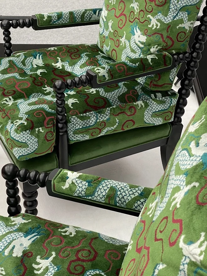
A room can be beautifully furnished and still feel unfinished. Often, the missing element is not another object but a considered layer of pattern, texture or tailored detail. Schumacher fabrics, wallpaper and trimmings offer precisely that expressive vocabulary: richly coloured grounds, archival-inspired motifs, graphic prints and finishing elements that bring an interior into focus.
For homes with a strong sense of identity, these materials are not simply decorative additions. They establish atmosphere, create rhythm from one room to the next and give bespoke upholstery or window treatments the presence of a commissioned piece. The art lies in choosing where each element will have the greatest effect.
Why Schumacher Fabrics, Wallpaper and Trimmings Endure
Schumacher has long occupied a distinctive place in decorative interiors because its collections balance historical reference with a lively, relevant point of view. A stylised botanical can feel fresh rather than formal; a classic stripe can become architectural; a small-scale print can lend intimacy to a quiet bedroom or reading room. The designs have character, but they also have the versatility to sit comfortably within contemporary, traditional and layered eclectic schemes.
This matters when furnishing a home intended to be lived in for years rather than refreshed with every passing trend. Pattern should reward repeat viewing. It should reveal nuance in changing light, converse with art and antiques, and retain its interest once the novelty of a newly finished room has passed.
The collections also invite a more decorative approach to composition. Rather than relying on one statement sofa or a single dramatic pendant, a room can be built through related gestures: a wallcovering with movement, a cushion edge picked out in contrast, a pair of chairs upholstered in a small-scale geometric, and curtains that frame the architecture with softness. Each layer has a role, and none need compete.
Begin With the Room’s Emotional Register
Before selecting a fabric or wallcovering, decide how the room should feel at the times it is most used. A drawing room for evening entertaining can carry deeper colour, a stronger repeat and a more theatrical trim than a sunlit family kitchen. A principal bedroom may call for a quieter mood, where tactile linen, a restrained stripe and a gently patterned paper create a sense of retreat.
Scale is the first practical consideration. Large, open rooms with generous ceiling heights can absorb expansive florals, wide stripes and mural-like wallcoverings. In a compact cloakroom, vestibule or alcove, an intricate print can become a jewel-box moment. The usual caution against using bold pattern in smaller spaces is too simplistic. What matters is whether the pattern suits the room’s proportions and whether the lighting allows it to be appreciated.
Look beyond the sample in isolation. Place it beside timber finishes, stone, lacquer, existing art and the metalwork that will remain in the room. A fabric’s ground colour can read entirely differently against warm oak than it does beside cool painted joinery. Order and judgement are as valuable as instinct at this stage.
Let One Element Lead
The most assured schemes usually begin with a clear lead material. This may be a vivid chinoiserie wallcovering, a hand-drawn floral for curtains or an exceptionally beautiful upholstery textile. Once chosen, it provides the palette and pace for the rest of the room.
A lead pattern does not require every companion to be plain. It simply needs breathing room. If the walls carry a large botanical, introduce a finer stripe, a textured solid and perhaps a small geometric on an occasional chair. Varying scale creates visual ease. Repeating the same size of motif throughout is more likely to make a room feel busy than generous.
Colour can be echoed with discretion rather than literal matching. Pull a softened mineral blue from a wallpaper into a velvet cushion, or use the warm red-brown found in a flower stem for the tape along a blind. These smaller connections make a layered room feel composed rather than assembled.
Using Schumacher Fabrics With Purpose
Fabric is where pattern becomes tactile. It changes how a chair is experienced, softens acoustics around a dining table and gives windows their sense of occasion. Yet different applications make different demands, so beauty alone should not determine the choice.
For upholstery, consider durability, rub count, weave structure and how the colour will wear in daily use. A delicate linen may be entirely right for a decorative bedroom chair but less suitable for a much-used family sofa. Conversely, a weightier woven textile or performance-quality fabric may offer the longevity required for a media room, banquette or property used by several generations.
Curtains allow for a more expansive expression, particularly where there is sufficient fullness for the pattern to fall beautifully. The direction of the repeat is worth discussing early. A vertical design can lengthen a room, while a broad horizontal stripe can emphasise width. Pattern matching across pairs of curtains, as well as allowance for shrinkage and lining, is a detail best planned before ordering.
Smaller upholstered pieces provide an intelligent place to be adventurous. A pair of slipper chairs, a headboard, a window seat or a tailored ottoman can carry an expressive print without asking the entire room to revolve around it. They are also ideal places to introduce a fabric that feels personally meaningful: a botanical that recalls a favourite garden, perhaps, or a graphic motif that gives a city flat greater energy.
Wallpaper as Architecture, Not Backdrop
Wallcovering has the power to alter a room’s apparent proportions and emotional temperature almost immediately. It can bring depth to a newly built interior, draw attention to handsome original cornicing or turn a passageway into a memorable part of the home rather than a route between rooms.
In more formal spaces, wallpaper can establish the room’s narrative. A finely detailed print behind a library of books or within dining-room panelling introduces depth without relying on overt ornament. In a contemporary setting, a bolder graphic or scenic design can provide contrast to crisp lines and restrained furniture.
Placement is as significant as the design itself. Papering all four walls delivers immersion, especially in bedrooms, powder rooms and smaller reception spaces. Using a wallcovering inside joinery, behind open shelving or above a dado offers a more edited gesture. Neither is inherently more luxurious. The right approach depends on the architecture, the amount of natural light and how much visual activity already exists in the room.
Do not overlook the importance of installation. Pattern matching, the position of a central motif, the treatment around windows and the relationship between paper and painted woodwork all affect the finished result. Fine wallcoverings deserve careful measurement and an experienced decorator, particularly where a large repeat leaves little margin for error.
The Quiet Precision of Trimmings
Trimmings are among the most persuasive tools in a decorative scheme because they make furnishings feel individual. A contrast welt can sharpen the silhouette of a sofa. A bullion fringe can bring a gentle sense of tradition to a skirted chair. A narrow tape can define the edge of a Roman blind or transform otherwise simple curtains into something more tailored.
Their effect should be intentional, not automatic. In a room already rich with pattern, choose a trim that acts as a clean line of punctuation. In a quieter setting, a more elaborate braid or fringe may be the detail that introduces movement and depth. Scale remains essential: a delicate tape may disappear on a substantial sofa, while a heavy fringe can overwhelm a finely proportioned occasional chair.
Trimmings are also useful for creating continuity when furnishing a room over time. The same tape can appear on a cushion, an ottoman and the leading edge of curtains, allowing pieces made months apart to feel connected. This is particularly valuable in larger homes, where every room need not match but should still belong to the same visual world.
A Considered Approach to Layering
The most successful decorative interiors do not treat fabric, wallpaper and trim as separate decisions. They are viewed together, alongside furniture shape, lighting, flooring and the movement of daylight across the room. A dramatic wallcovering may ask for sculptural, quieter furniture. A restrained backdrop may give permission for more spirited upholstery. A trim can bridge the two, carrying colour from the wall to the window treatment with almost imperceptible finesse.
There are trade-offs. A statement pattern can be transformative, but it may limit future changes to artwork or major furniture. A richly trimmed scheme has a sense of craft and permanence, but requires excellent making to avoid feeling overworked. For many homes, the answer is a balance: invest in a few enduring materials with genuine presence, then let the surrounding elements give them air.
At Tobias Oliver Interiors, this level of selection is approached as a conversation between material, architecture and the life a home is meant to hold. The aim is not decoration for its own sake, but rooms that evoke emotion and become more personal with time.
Choose the pattern that makes you pause, then give it the proportion, craftsmanship and companions it deserves. That is when a beautifully appointed room begins to tell its own story.

9th October, 2026

7th October, 2026