





A room rarely feels truly resolved when every textile speaks in the same voice. The most compelling interiors rely on contrast – a dry linen against polished velvet, a tactile bouclé beside crisp cotton, a lustrous silk offset by a brushed wool. If you are considering how to mix luxury fabrics, the goal is not simply to combine expensive materials. It is to create rhythm, depth and atmosphere in a way that feels collected rather than contrived.
Luxury fabric schemes succeed when they engage both the eye and the hand. They shape how a space is experienced from morning light to evening lamplight, from a formal sitting room to a bedroom intended for retreat. The difference between a room that feels flat and one that feels quietly sophisticated often comes down to texture, weight and finish.
How to mix luxury fabrics with intention
The strongest starting point is to think beyond pattern and colour alone. Fabric has character. Linen feels relaxed and airy. Velvet introduces richness and absorbs light in a distinctive way. Bouclé adds volume and softness. Silk catches movement and light with a more formal elegance. Wool brings substance, warmth and a tailored quality.
Rather than asking which fabrics go together in theory, ask what role each one should play in the room. A drawing room might need a foundation fabric for upholstery, a secondary textile for drapery and then smaller accents for cushions or trimmings. A bedroom, by contrast, often benefits from a gentler hierarchy, where the fabrics are quieter but still varied enough to avoid monotony.
This is where many schemes become overworked. If every fabric is trying to be the hero, the room feels restless. One or two lead materials should set the tone, while others provide support.
Start with a dominant texture
In most interiors, one fabric should anchor the scheme. This is usually the textile used on the largest surface, such as a sofa, headboard or principal armchairs. Choosing this first gives the room a clear point of reference.
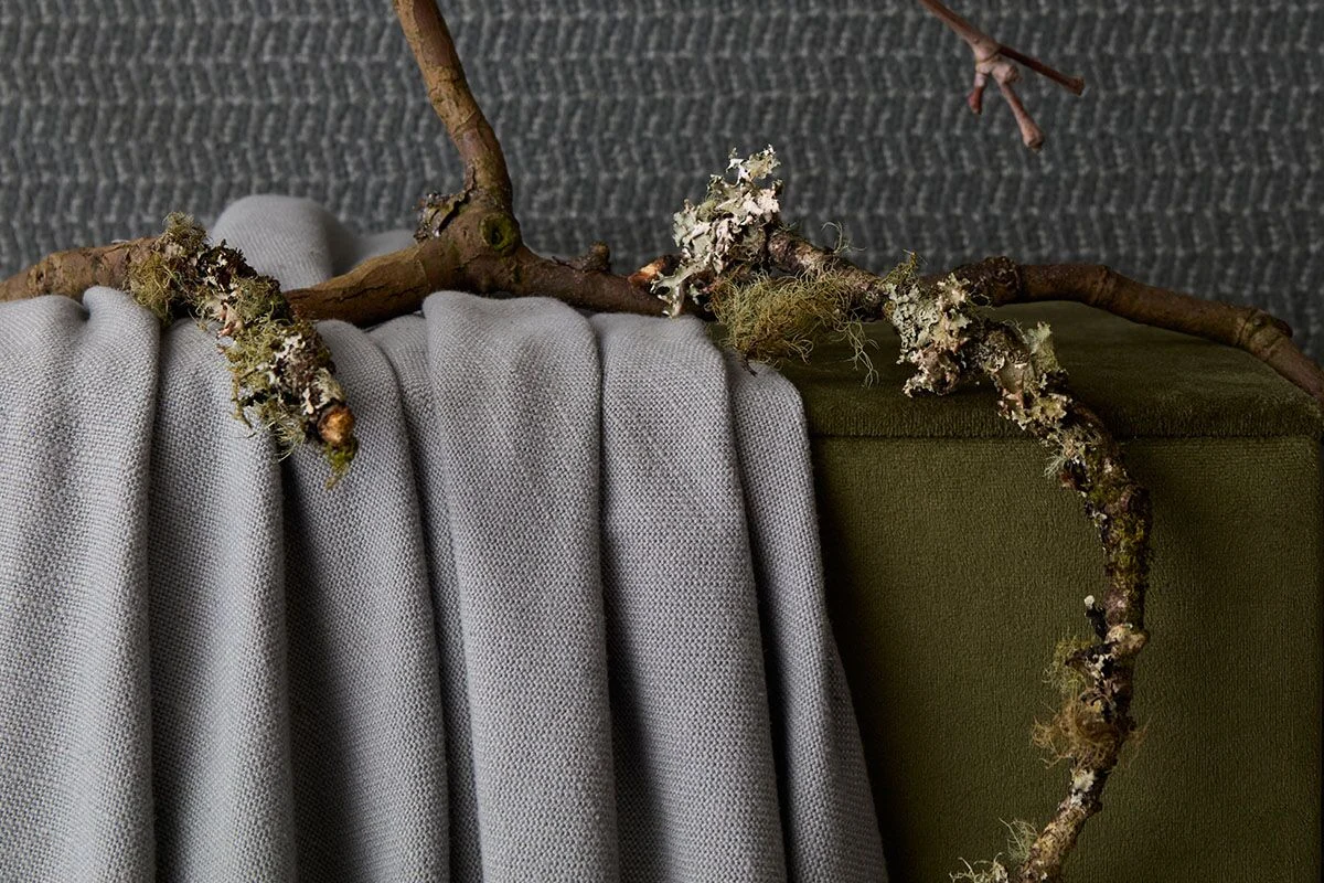
If you begin with velvet, for example, you already have visual density and a soft sheen. That suggests pairing it with something drier and more relaxed, such as washed linen or a textured weave, to prevent the room becoming overly formal. If your base is linen, you may want to introduce something with more body, such as bouclé or wool, so the scheme does not feel too lightweight.
Scale matters here as much as finish. A generous sectional in a heavy bouclé carries far more presence than a small occasional chair in the same cloth. Let proportion guide your decisions.
Balance matte and lustre
One of the simplest ways to refine a fabric palette is to balance surfaces that absorb light with those that reflect it. Rooms become visually richer when not everything has the same finish.
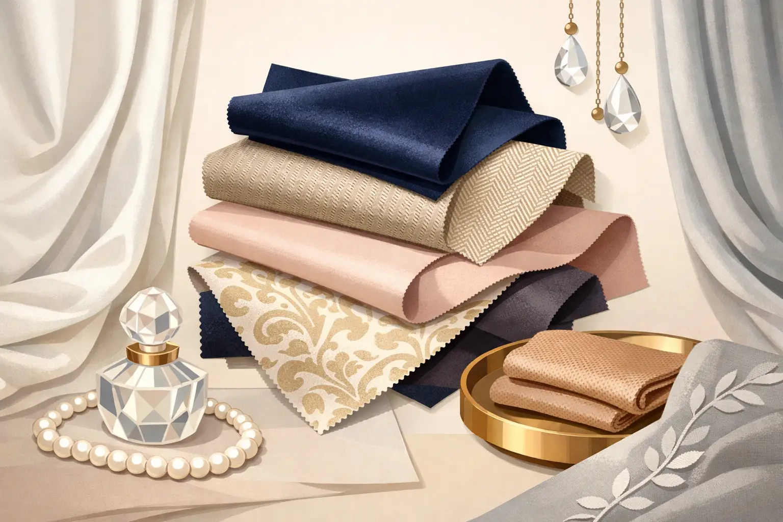
Matte fabrics such as linen, wool and cotton provide calm. Lustrous fabrics such as velvet, silk and certain jacquards bring energy and movement. The pairing works because each one sharpens the qualities of the other. A silk cushion on a linen sofa feels deliberate. Velvet curtains in a room with brushed wool upholstery feel elegant rather than heavy.
There is, however, a threshold. Too many reflective surfaces can make a room feel self-conscious, particularly in spaces intended for daily living. Equally, an entirely matte scheme may read as worthy rather than luxurious. The sweet spot is usually a measured contrast.
Layering luxury fabrics room by room
Different rooms call for different fabric conversations. A formal reception room can hold stronger contrast and more decorative detail. A family sitting room needs comfort to sit alongside visual polish. A bedroom often asks for softness first, with luxury expressed through touch rather than overt glamour.
In living spaces
Living rooms respond well to a layered mix of upholstery weights. A tailored sofa in a refined linen or wool blend can be paired with slipper chairs in velvet or mohair, then softened with cushions in embroidery, silk or a patterned woven textile. This creates a room that feels composed but not static.
If the architecture is minimal, richer fabric combinations add warmth and complexity. In more traditional rooms with panelling, cornicing or antique pieces, a simpler textile palette often feels more modern and assured. It depends on where you want the drama to sit – in the architecture, the furnishings or the fabrics themselves.
In bedrooms
Bedrooms benefit from fabric combinations that feel cocooning without becoming oppressive. Upholstered headboards in velvet, brushed wool or softly textured linen work particularly well because they add comfort and quiet luxury. Around them, lighter materials such as cotton percale, silk-blend cushions or a cashmere throw can create a nuanced layering effect.
Here, restraint is valuable. A bedroom with too many competing fabric stories can lose its sense of calm. Keep the palette edited and let subtle differences in weave and finish do the work.
In dining rooms and occasional spaces
Dining rooms, studies and entrance halls can carry more confident fabric choices because they are often used differently and for shorter periods. A high-sheen velvet on dining chairs, a dramatic embroidered blind or a sculptural bouclé bench can all be highly effective.
These rooms are ideal for fabrics that might feel too assertive in a bedroom but entirely right in a more transitional or entertaining setting. The key is to maintain a thread of continuity with the rest of the home, whether through colour, tone or material family.
Colour is only part of the equation
When people consider how to mix luxury fabrics, they often focus first on matching colours. Yet some of the most sophisticated interiors are built from tonal variation rather than direct coordination.
Working within a restrained palette – ivory, oat, tobacco, olive, charcoal, umber, mineral blue – allows texture to become more apparent. A stone-coloured linen beside an ivory bouclé and a pale taupe velvet can feel deeply layered, even though the colour differences are slight. This approach is especially powerful in contemporary interiors where the mood is understated.
By contrast, if you are using richer tones such as oxblood, peacock, saffron or forest, texture becomes a way to control intensity. A saturated colour in matte linen reads very differently from the same hue in silk velvet. One feels grounded, the other theatrical. Neither is wrong, but they tell different stories.
Pattern should be earned
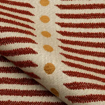
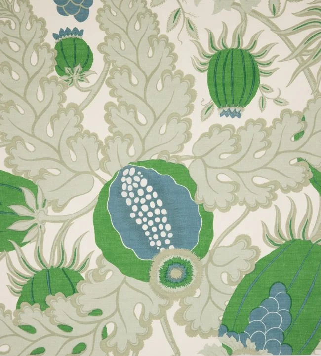
Pattern can elevate a scheme, but it should be introduced with discipline. If your hero fabrics already have strong texture, adding several elaborate patterns may create visual noise. Often, one patterned fabric is enough, supported by plains and textured neutrals.
A useful principle is to vary one thing at a time. If you choose a large-scale print for curtains, keep the upholstery quieter. If you use a nubby bouclé on a statement sofa, a smooth patterned cushion can provide contrast without excess. The most elegant rooms rarely announce every idea at once.
Practical considerations matter
Luxury should never mean impracticality for its own sake. A fabric may be exquisite, but if it does not suit the way a room is lived in, it will not age beautifully.
A formal silk on dining chairs in a household with young children may require more maintenance than is sensible. A pale bouclé in a high-traffic family room can be stunning, but only if the setting supports it. Linen is wonderfully forgiving in many environments, while velvet can be surprisingly durable depending on its composition and intended use.
This is where expert sourcing matters. The finest schemes balance beauty with performance, selecting fabrics not only for appearance but for how they respond to wear, light and handling. A luxury interior should feel effortless to live with, even when every element has been chosen with great care.
The finishing layer gives fabrics clarity
Trimmings, borders and tailored detailing can transform a textile scheme from attractive to fully considered. A contrast welt on a sofa, a refined braid on the leading edge of a curtain or a simple flange on cushions can sharpen the relationship between fabrics.
Used sparingly, these details bring definition and craftsmanship. Used too heavily, they can make a room feel mannered. The answer, as ever, lies in balance. In many contemporary interiors, one beautifully judged trim is more powerful than several decorative additions.
For clients shaping homes with quiet distinction, this is often where the scheme becomes personal. A considered mix of textiles from houses such as Dedar, de Le Cuona, Pierre Frey or Nobilis can create a layered language of comfort and refinement that feels entirely individual.
The most memorable rooms do not rely on a single luxurious gesture. They build emotion through contrast, through tactility, through the confidence to let one fabric soften another. When you approach luxury textiles with that level of intention, the room begins to tell a richer story – one that feels as beautiful to live in as it does to look at.

13th July, 2026

12th July, 2026