A room can look impeccably composed on paper and still fall short the moment you sit down, draw the curtains or notice how the light lands across a sofa at dusk. Fabric is often where an interior either deepens into something memorable or feels merely finished. A thoughtful designer fabric selection guide is not about choosing what is fashionable at first glance. It is about selecting textiles that shape atmosphere, soften architecture and live beautifully over time.
In high-value interiors, fabric carries more responsibility than many clients expect. It absorbs light, introduces movement, controls comfort and often determines whether a scheme feels richly layered or strangely flat. The right textile can make stone feel warmer, timber feel more elegant and a large room feel more intimate. The wrong one can interrupt the whole composition, however exquisite the furniture may be.
What a designer fabric selection guide should actually help you decide
The first question is rarely colour. It is use. A drawing room used for evening entertaining asks different things of a fabric than a family snug, a formal principal bedroom or a villa in strong coastal light. Performance matters, but so does character. A tightly woven linen may offer crispness and restraint, while a washed velvet introduces a more enveloping mood. Neither is inherently better. It depends on how you want the room to feel and how the space will be lived in.
This is where many fabric decisions become overly narrow. Clients are often shown swatches and asked what they prefer visually, yet the more valuable conversation is about rhythm, touch and durability. Does the room need quiet texture or a focal point? Should the curtains pool with softness or hold a cleaner architectural line? Will the upholstery be used daily by children and guests, or occasionally in a more formal setting? Luxury lies in these distinctions.
A well-considered scheme usually balances three things at once – aesthetic intent, practical performance and the emotional register of the room. If one of those is ignored, the result rarely has staying power.
Starting with the architecture, not the sample book
The most convincing fabric schemes respond to the room itself. Ceiling height, orientation, wall finish and joinery all influence what will work. In a period property with generous cornicing and tall windows, a silk-mix or elegant wool weave may enhance the sense of scale and formality. In a contemporary penthouse with cleaner lines, boucles, dry linens and refined textured weaves often feel more natural.
Light is especially influential. Northern light can flatten some colours and exaggerate cool undertones, while intense southern exposure may bleach delicate tones and place more stress on natural fibres. A soft stone linen that looks perfect in a showroom may read grey in one home and golden in another. This is why a fabric should never be judged in isolation. It must be seen against the architecture, the palette and the intended mood.
Pattern also needs architectural discipline. In expansive rooms, larger scale designs can hold their own and prevent a scheme from feeling timid. In smaller or more intricate spaces, subtle patterning often works harder because it adds detail without visual noise. The goal is not simply to add interest. It is to create proportion.
Choosing the right fabric for the right application
A practical designer fabric selection guide should distinguish clearly between upholstery, drapery and decorative use, because one textile rarely performs equally well across all three.
For upholstery, structure is everything. Seat cushions, headboards and dining chairs need fabrics with enough body to hold shape and enough resilience to withstand repeated use. This is where tightly woven linens, performance blends, wool-rich fabrics and certain velvets tend to excel. Boucle can be deeply inviting, but it needs careful placement. On an occasional chair it can feel sculptural and luxurious. On a heavily used family sofa, it may not always be the wisest choice.
Curtains require a different intelligence. Movement, weight and drape come before abrasion resistance. A beautifully cut curtain should respond to gravity in an elegant way, neither hanging stiffly nor collapsing without presence. Linen remains a favourite for good reason – it filters light with grace and introduces a relaxed sophistication. Yet linen also creases, and in very formal rooms or highly polished developments, a silk-linen blend or a more stable woven may offer the same softness with better control.
Decorative textiles sit somewhere else entirely. Embroidered panels, artisanal trims and statement prints do not need to work hardest on wear. Their role is to bring distinctiveness, a point of view and often a layer of craftsmanship that elevates the whole room. Used sparingly, these details can make a scheme feel bespoke rather than assembled.
Texture is often more powerful than colour
In luxury interiors, the most enduring schemes are rarely dependent on bold colour alone. They rely on texture to create nuance. This is what gives a neutral room depth rather than blandness and allows a restrained palette to feel expensive.
Consider the interplay of matte and lustre, smooth and irregular, tailored and tactile. A chalky wallcovering beside brushed oak and dry linen creates one kind of calm. Add velvet, bouclé or artisanal embroidery, and the atmosphere becomes richer and more sensorial. This layering is especially effective in contemporary interiors where the architecture is pared back. Fabric becomes one of the principal ways to introduce warmth and personality without clutter.
There is also a difference between visible texture and tactile texture. Some fabrics appear lively from across the room but feel relatively flat to the touch. Others reveal their luxury only when handled. The best schemes usually include both. They engage the eye immediately, then reward closer experience.
Luxury fabric choices and the trade-offs worth understanding
Every fabric comes with its own terms. Natural fibres offer beauty, breathability and an ease that synthetic alternatives often struggle to replicate, but they can be more susceptible to fading, marking or movement. Velvet delivers incomparable depth and glamour, though pile direction and pressure marks need to be understood rather than treated as flaws. Linen has honesty and softness, yet it is not meant to behave with rigid perfection.
Performance fabrics have improved significantly and can be an intelligent choice in family homes, yachts, hospitality settings or sun-drenched residences. Still, not every high-performance textile carries the same visual sophistication as a couture-grade woven from a heritage mill. In formal spaces, that difference can matter.
This is why selection should never be reduced to a simple hierarchy of best and worst. The question is always where the fabric is being used, how the room should feel and what sort of patina the client is willing to embrace. Some interiors benefit from a little evidence of life. Others call for greater control.
How to build a fabric scheme that feels collected, not overdesigned
The strongest interiors do not rely on every textile demanding attention. They create a measured conversation between quieter foundations and more expressive moments. A sofa in a beautifully understated weave may allow a pair of accent chairs in patterned fabric to sing. A calm bedroom can accommodate a dramatic trim or embroidered cushion because the larger surfaces remain composed.
This is also where tonal variation becomes more useful than strict matching. Instead of selecting everything in one exact shade, consider a family of related tones with different depths and finishes. Ivory, oat, parchment and warm stone can sit together with greater richness than a single flat neutral repeated throughout. The same applies to darker palettes. Tobacco, umber, olive and charcoal often feel more layered than one dominant colour used everywhere.
For clients furnishing an entire residence, consistency matters, but repetition can become predictable. It is better to establish a clear language – perhaps tactile natural fibres, tailored drapery and one or two moments of artistic pattern – then vary the expression from room to room.
Why sampling and expert guidance matter
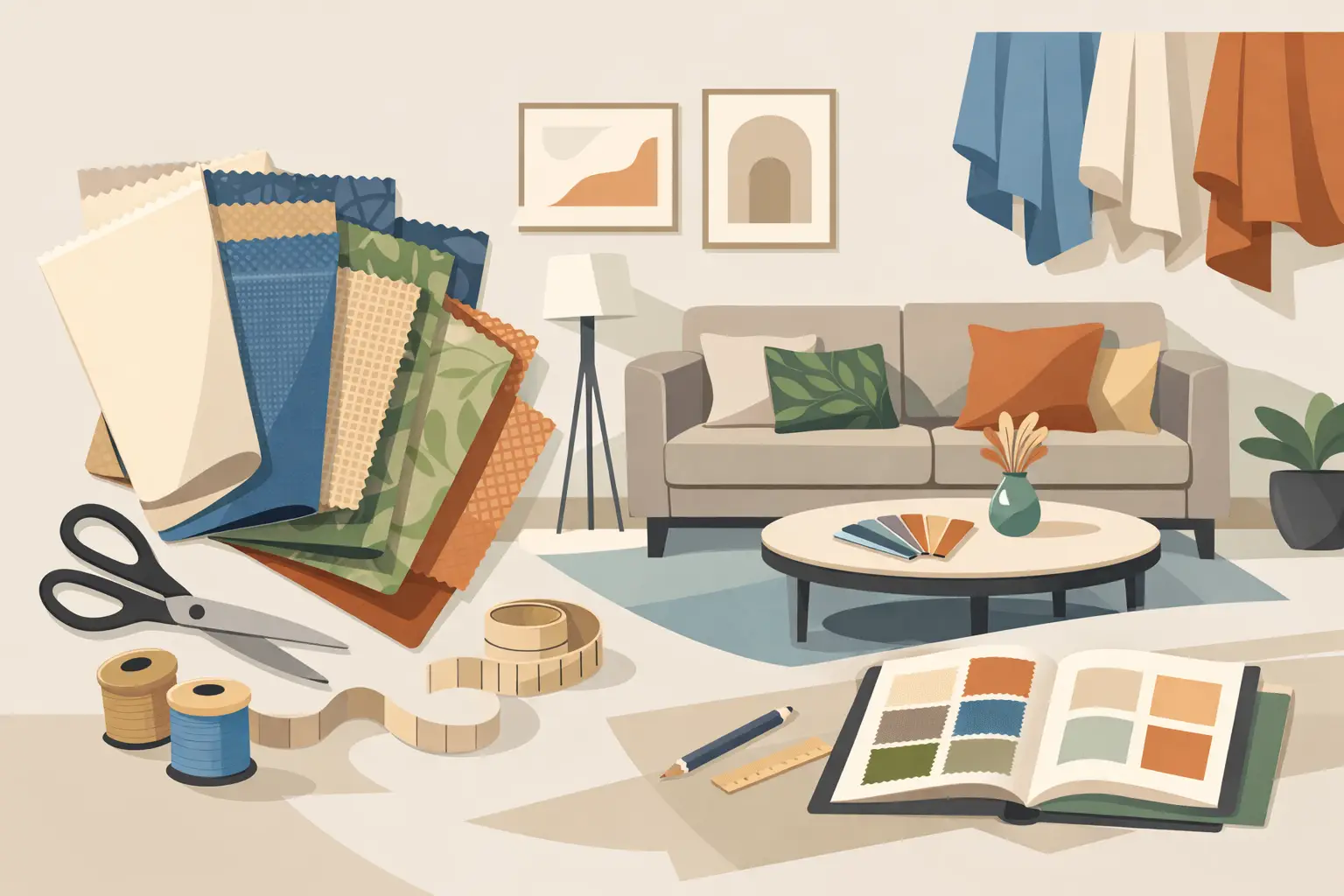
Even the most experienced eye cannot make final decisions from a digital image or a small memo alone. Scale changes perception. So does lining, interlining, backing and the direction of light at different times of day. A fabric that appears understated in a hand sample may become far more pronounced when upholstered across a large sectional or hung full-height at generous width.
This is why specialist guidance is not simply about access to prestigious fabric houses. It is about editing. The world of luxury textiles is vast, and discernment is what turns possibility into coherence. A curated approach saves time, but more importantly, it protects the integrity of the scheme.
At Tobias Oliver Interiors, that curation sits at the heart of the process. Internationally respected houses such as Dedar, de Le Cuona, Nobilis, Pierre Frey and Rubelli each bring a distinct design language, and selecting between them is rarely a matter of trend. It is a matter of fit – aesthetic, practical and architectural.
A beautifully judged fabric scheme should feel inevitable once installed, as though the room could never have been finished any other way. That is usually the result of restraint, expertise and a willingness to choose with the long view in mind.

21st September, 2026

19th September, 2026