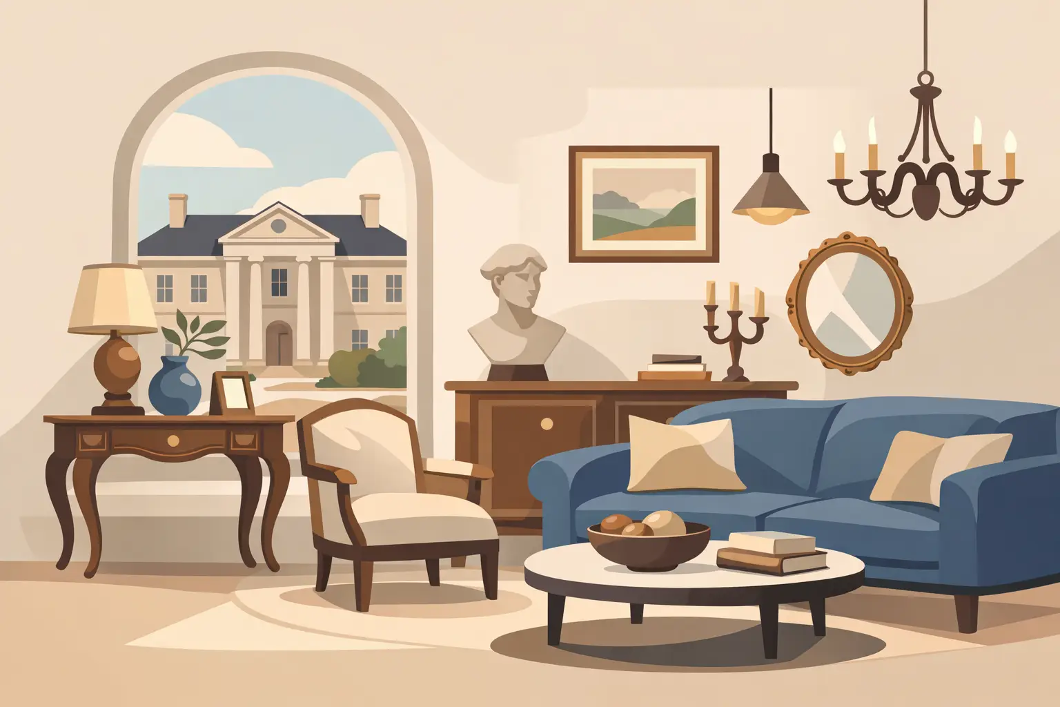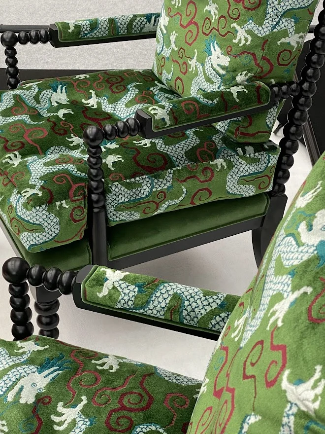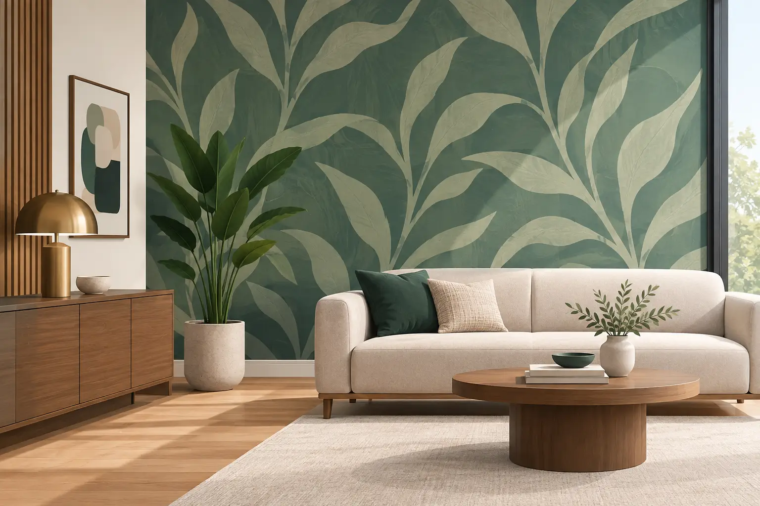
A beautiful room is often remembered for what surrounds it. Designer wallcoverings have the rare ability to alter a space before a single piece of furniture is considered: they can soften architecture, heighten a sense of drama, bring intimacy to generous proportions or give a quiet room a more purposeful identity. Rather than functioning as a backdrop, they become part of the composition – a material expression of how a home should feel.
For considered interiors, wallcovering is not simply a decorative choice. It is an opportunity to introduce artistry, tactility and narrative at a scale that paint alone cannot always achieve. The right design can make a hall feel ceremonial, a bedroom feel cocooning, or a dining room feel ready to hold an evening long after the last course has been served.
Why designer wallcoverings have lasting presence
The distinction begins with design integrity. Collections from houses such as Dedar, Pierre Frey, Rubelli, GP & J Baker and Christopher Farr Cloth are informed by specialist craft, original artwork, archival references and a sophisticated understanding of proportion. Their patterns are not created to fill a wall. They are composed to reward closer attention, whether through the slight irregularity of hand-led printing, the layered depth of a woven ground or the considered movement of a large-scale motif.
This is why designer wallcoverings can feel quietly compelling even in restrained schemes. A tonal grasscloth, for example, brings a living variation to light that changes throughout the day. A finely drawn botanical carries atmosphere without necessarily becoming overtly traditional. A contemporary geometric can organise an otherwise expansive room, lending rhythm to clean-lined furniture and sculptural lighting.
There is also a material quality that photographs rarely communicate in full. Linen, silk, raffia, paper weave, suede-effect finishes and embossed grounds each respond differently to light and touch. These surfaces shape experience. They add warmth to plaster and joinery, temper the hard lines of stone or glass, and make a room feel more layered and complete.
Begin with the room, not the pattern
The most successful choice rarely begins with a sample that looks striking in isolation. It starts with the room’s architecture, natural light and intended use. A wallcovering may be exquisite, yet still feel misplaced if its scale works against the ceiling height, if its ground colour cools an already shaded room, or if its formality conflicts with the way the space is lived in.
In a north-facing drawing room, a warm neutral, tobacco, olive or softly burnished metallic may create more depth than a pale grey paper. In contrast, a sun-filled room can carry cooler mineral tones, chalky blues or a densely layered pattern without feeling heavy. The direction of light matters as much as its quantity. Observe the room in the morning, afternoon and evening before committing, particularly where an intricate print or reflective finish is under consideration.
Purpose matters too. A principal bedroom can accommodate a design that feels personal and enveloping because it is experienced at close range. A reception room may call for more visual clarity, allowing art, upholstery and guests to coexist comfortably. In a corridor or stairwell, where one moves through rather than settles, a bolder pattern can create a memorable passage and establish a home’s point of view from the outset.
Scale changes everything
Clients often hesitate over large-scale designs, especially when reviewing a small cutting. Yet scale should be judged on the wall, not in the hand. A generous mural or oversized foliage can read surprisingly calm across a full elevation, where its repeat has room to breathe. Conversely, a small, busy motif may feel more insistent when repeated across an entire room.
Consider viewing distance. In a large sitting room, broad strokes and open repeats create a composed impression from across the space. In a compact cloakroom, a detailed print can offer a richly immersive moment, provided the joins and focal walls are carefully planned. There are no fixed rules about small rooms requiring small patterns. The more useful question is whether the design creates intention rather than visual noise.
Selecting a finish that suits real life
Luxury should be lived with, and the practical character of a wallcovering deserves equal attention. A handwoven grasscloth brings incomparable texture, but natural fibres carry tonal variation and visible seams. This is part of their appeal, not a defect, although it may not suit someone seeking uniformity. In a formal study, bedroom or low-traffic sitting room, this variation can feel wonderfully architectural.
For busy family rooms, entrance halls or hospitality settings, performance-led vinyls and contract-quality finishes can offer a more resilient alternative. The best contemporary examples have moved far beyond a utilitarian appearance, recreating woven linen, plaster, leather and textile effects with impressive refinement. They are often easier to clean and more forgiving around everyday wear, but they may lack the subtle depth and individuality of a natural wallcovering.
Silk and delicate textile wallcoverings introduce a particular softness and luminosity, especially when paired with restrained lighting. They are best reserved for spaces where they will not meet frequent abrasion or moisture. Kitchens, bathrooms and poolside rooms demand a more technical assessment: adequate ventilation, substrate preparation and a finish designed for the environment are essential. Even an exceptional product cannot compensate for an unsuitable setting.
Do not overlook installation
The quality of installation has a profound effect on the final result. Fine papers require careful wall preparation, accurate setting out and an installer experienced with the specific material. This is especially true for panels, murals, wide-width designs and natural weaves, where planning the placement of seams is part of the design process.
Order sufficient material from the outset, allowing for the pattern repeat, architectural interruptions and sensible contingency. Reordering later can introduce a different batch, and natural materials may show variation between runs. For a tailored finish, consider where the eye will land first: the wall opposite a doorway, the elevation behind a bed, or the space above a mantelpiece. This is where the composition should feel most resolved.
Building a layered scheme around wallcovering
Once a wallcovering has been chosen, it should guide the room without dictating every detail. A successful scheme draws from its colour language, line and mood rather than matching every element too literally. If a paper contains muted rust, faded indigo and parchment, one might select a single accent for piping or a cushion, then allow complementary timber, bronze and stone finishes to carry the rest of the story.
Texture is particularly valuable. A smooth lacquered console against a woven wallcovering offers contrast; bouclé upholstery beneath a graphic print adds softness; antique brass lighting can bring a quiet glow to a matte mineral ground. The aim is balance. When the walls are expressive, furniture silhouettes may need greater restraint. When the wallcovering is tonal and textural, a more sculptural chair or distinctive decorative object can take centre stage.
It also helps to consider continuity beyond one room. A home does not need a single repeated palette, but adjacent spaces should acknowledge one another. This may be through a shared undertone, a recurring lacquer colour, timber finish or metal. In larger residences, wallcoverings can provide an elegant wayfinding device, moving from lighter and more open public spaces to deeper, more enveloping private rooms.
Where to make the strongest statement
A full-room treatment has presence, but it is not the only route. A wallcovering can transform the inside of a library, define a dining alcove, enrich a dressing room or give architectural focus to the wall behind a bed. Ceiling applications can be extraordinary in the right setting, particularly in a study or intimate dining room, though they require confidence in both the pattern and the room’s lighting.
For period properties, wallcovering can honour original detailing without turning the interior into a pastiche. For contemporary homes, it introduces the warmth and visual memory that minimal architecture sometimes lacks. In both cases, the strongest choices are those that appear integral to the house, as though they have always belonged there.
At Tobias Oliver Interiors, a curated approach to wallcovering considers more than the sample itself: it considers the atmosphere it will create, the materials it will meet and the life that will unfold around it. Choose the design that continues to reveal something new in changing light, across changing seasons and through the years a home becomes truly your own.

13th September, 2026

11th September, 2026