


Floor-to-ceiling glazing, long sightlines and a city skyline can make a penthouse feel extraordinary – but they can also leave it feeling exposed, acoustically hard and curiously impersonal. That tension is exactly what makes a penthouse interior design case study so revealing. The most successful schemes do not simply decorate a premium property. They resolve scale, light, privacy and atmosphere in a way that feels deeply considered and entirely effortless.
In this project, the brief was not to create spectacle for its own sake. The clients wanted a residence that felt calm, cultivated and quietly impressive – a home for entertaining, yes, but equally for retreat. They were drawn to contemporary forms, tactile materials and a palette with depth rather than obvious contrast. The challenge lay in shaping a penthouse that honoured its architecture while softening its harder edges and creating emotional warmth.
What this penthouse interior design case study reveals
A penthouse often arrives with architectural advantages already in place: generous volume, abundant daylight and views that carry the eye far beyond the room itself. Yet those same qualities can flatten an interior if every surface is left visually open and every furniture grouping floats without purpose. In this case, the design direction began with zoning rather than styling.
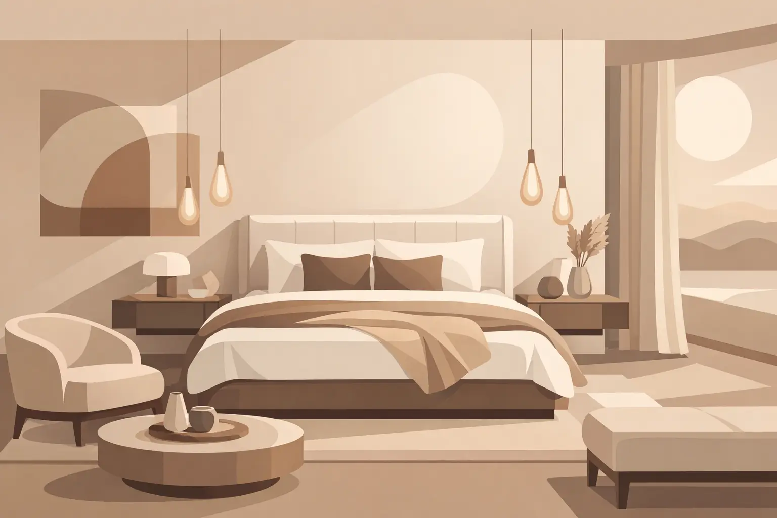
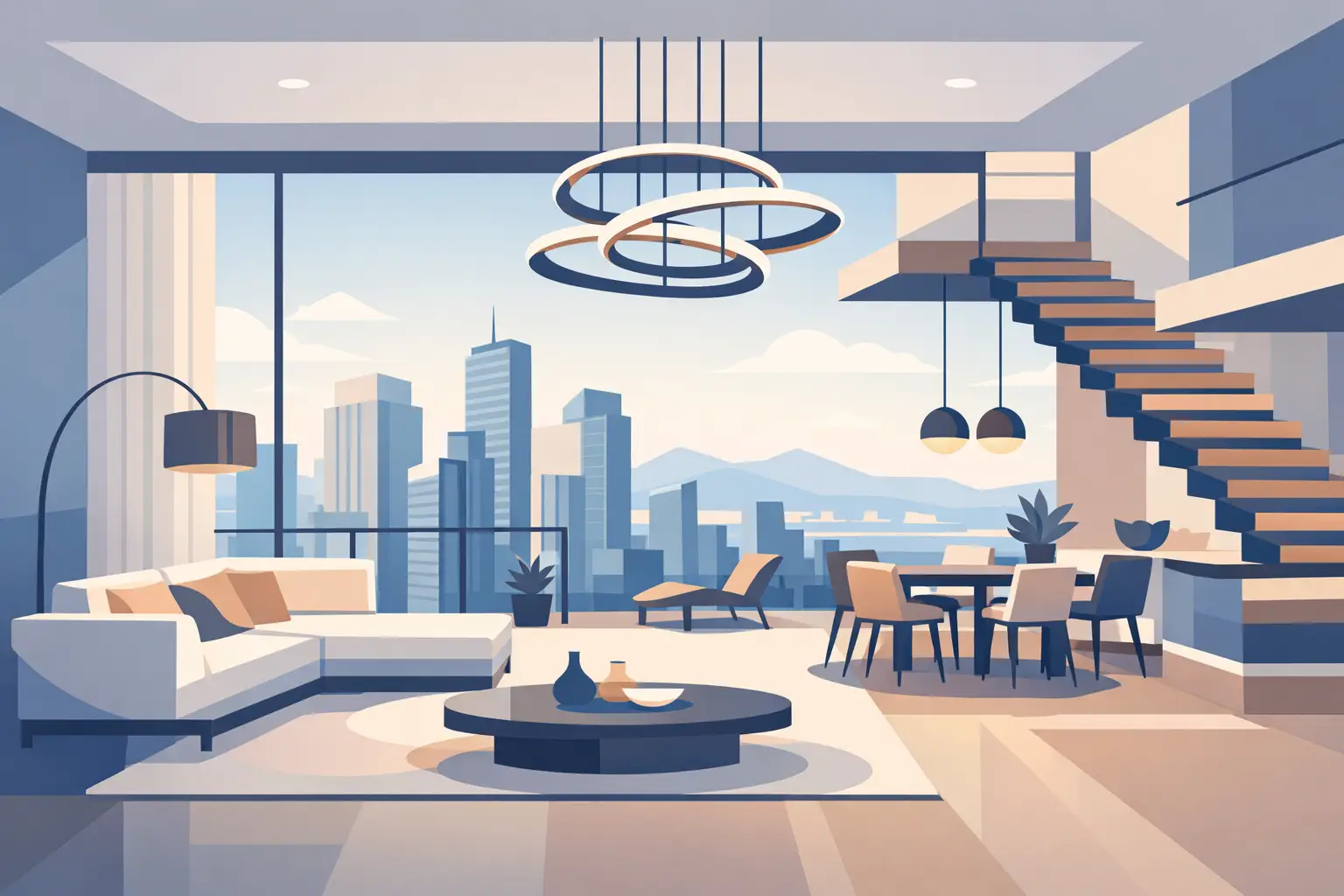
The main reception space was expansive, with living, dining and kitchen functions sharing one open plan footprint. Instead of dividing the room physically, the scheme introduced distinctions through texture, lighting hierarchy and scale. A sculptural chandelier anchored the seating area, while lower, more intimate pools of lamplight created a slower rhythm by evening. This mattered because penthouses are rarely enjoyed in one mode. They need to perform elegantly at midday, at dusk and during larger gatherings, without ever feeling theatrical.
Materiality did much of the quiet work. Hard finishes already present in the shell – stone flooring, metal detailing and broad panes of glass – were balanced with boucle upholstery, brushed oak, smoked glass, hand-finished plaster tones and generous drapery. The effect was not decorative layering for its own sake, but calibration. Luxury in a penthouse is often less about adding more and more, and more about introducing the right resistance to sleek architecture so the home feels grounded.
Planning for scale, not just beauty
One of the most common mistakes in high-value flats is under-furnishing. Rooms of this size can absorb furniture alarmingly quickly, which is why pieces that appear ample in a showroom can feel diminished in situ. Here, every major item was selected with both visual mass and legibility in mind.
The principal seating arrangement used a low, expansive sofa composition to preserve the horizon line to the windows, paired with a substantial coffee table in richly veined stone. Occasional chairs added silhouette and conversation balance without cluttering circulation. In the dining area, a table with a sculptural base brought presence when viewed from multiple angles, while dining chairs in textured fabric softened the geometry.
This is where craftsmanship becomes visible in a more subtle way. In a penthouse, furniture is rarely seen against busy backdrops. It is silhouetted against skyline, glazing and open space. Every proportion, join and finish has nowhere to hide. Pieces must hold their own architecturally while still contributing to ease and comfort.
The same principle shaped the ancillary spaces. In the study, joinery was kept tailored and restrained, with a desk that read more like a finely composed object than a conventional office solution. In the main bedroom, the scale became more enveloping. A generous headboard, layered textiles and softly reflective bedside lighting shifted the mood away from the public confidence of the reception rooms towards privacy and restoration.
Lighting as architecture within the room
If one element defined the transformation most clearly, it was lighting. Daylight is plentiful in a penthouse, but daylight alone does not create atmosphere. By evening, large glazed spaces can become dark mirrors unless lit with precision and restraint.
The lighting strategy was built in layers. Decorative ceiling fixtures provided focal points, but never carried the entire scheme. Wall lights introduced vertical warmth, table lamps created intimacy, and integrated lighting within joinery sharpened form without glare. In key positions, alabaster and hand-finished materials were chosen for their ability to diffuse light softly, avoiding the clinical effect that can undermine even the finest interior.
There is also a practical discipline to luxury lighting that is sometimes overlooked. Reflection matters. Glare matters. Shade placement matters. In this project, fittings were selected not only for sculptural beauty but for how they would perform against glass at night and alongside polished surfaces. A beautiful lamp that produces harsh reflection in a skyline-facing room is not a luxury choice. It is simply the wrong one.
For clients considering a similar project, this is often the area where design value is felt most immediately. Lighting changes how art is perceived, how skin tones appear at dinner, how textures read, and how a room settles at the end of the day. It does not merely illuminate. It shapes experience.
The role of fabrics, wallcoverings and finishing details
Textiles were central to bringing warmth and refinement into the scheme. In open, light-filled flats, fabric has a dual role: it moderates acoustics and introduces softness without reducing clarity. Here, curtains were full and architectural rather than fussy, chosen to frame the windows beautifully when open and provide a sense of enclosure when drawn.
Upholstery fabrics moved within a nuanced tonal family – mineral, sand, stone, tobacco and muted charcoal – allowing variation through weave and handle rather than overt colour contrast. This approach gave the interior longevity. Strong trend-led colour can be compelling in smaller moments, but a penthouse intended for years of living benefits from a palette with patience.
Wallcoverings were used selectively. Rather than applying pattern broadly, textured finishes appeared in spaces where intimacy mattered most: a bedroom wall behind the bed, a dressing area, a discreet powder room. These interventions shifted the emotional tone of each room without disturbing the architectural calm of the overall scheme.
The final sophistication came through details that many clients notice instinctively even if they do not name them directly. Bespoke trimmings on cushions, the weight of a curtain edge, the finish on a cabinet handle, the depth of a rug pile beneath bare feet – these are not ornamental afterthoughts. They are the cues that tell the body a room has been carefully resolved.
Trade-offs in any penthouse interior design case study
Every refined interior is a negotiation. In this penthouse interior design case study, preserving openness had to be balanced against the need for intimacy. The clients wanted clean sightlines, but not a home that felt sparse. They wanted statement pieces, but not visual noise. They wanted contemporary luxury, but not anything that might date quickly.
That meant resisting easy extremes. Over-minimal spaces can feel cold in elevated urban settings, yet over-layering can obscure the very architecture that makes penthouse living so desirable. The answer sat in controlled contrast: sculptural forms against calm backdrops, rich textures within a restrained palette, and carefully edited focal points rather than repeated gestures.
Budget allocation followed the same logic. Investment was concentrated where the eye lingers and where the hand engages most often – seating, lighting, drapery, dining pieces and bedroom comfort. Not every item needs equal prominence, but every visible element must feel coherent. Affluence does not excuse inconsistency. If anything, it makes inconsistency easier to spot.
For globally minded clients furnishing residences across London, Dubai, New York or the Riviera, this kind of discipline is especially valuable. Architectural contexts change, but the principles of liveable luxury remain strikingly consistent: proportion, craftsmanship, texture, atmosphere and a clear emotional point of view.
A well-composed penthouse should never feel as though it has been furnished to impress a photograph. It should feel composed around the way life actually unfolds there – morning light in the kitchen, a quiet drink against the skyline, guests gathering easily, bedrooms that lower the pulse. At Tobias Oliver Interiors, that is often where the most lasting luxury resides: not in excess, but in rooms that know exactly what they are trying to make you feel.
The finest penthouse interiors do not compete with the view. They give it a counterpart – a setting with enough depth, beauty and restraint to make coming home feel every bit as compelling as looking out.

26th June, 2026

25th June, 2026