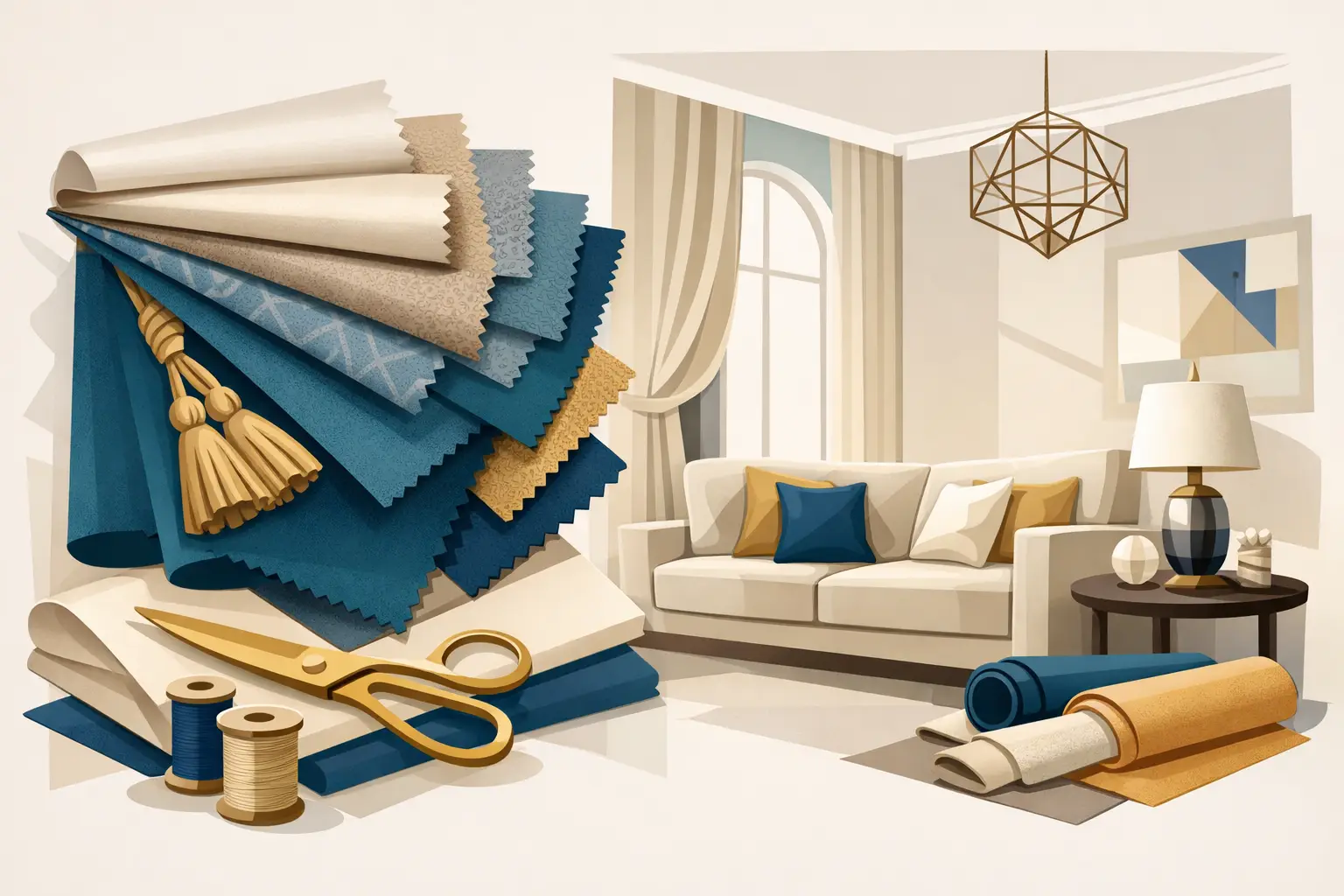
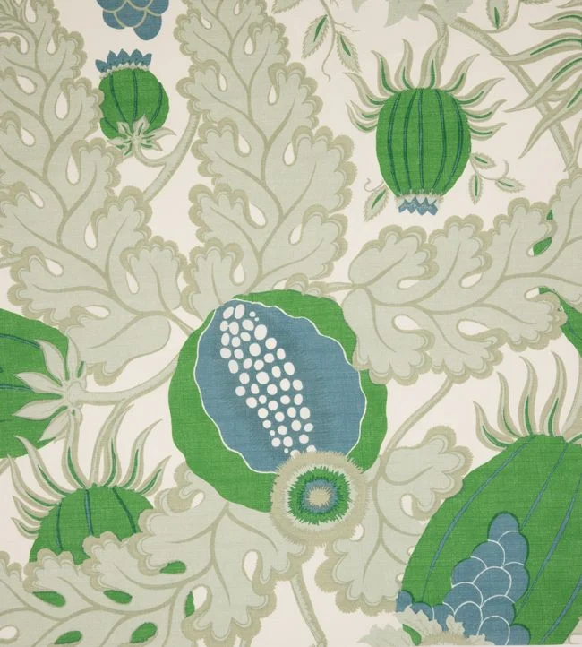
A beautifully made curtain is never merely a window covering. It moderates light, frames a view and gives a room its sense of proportion. Decorative trimmings for curtains add the final, highly considered detail: a line of texture that can make a plain linen feel more architectural, lend weight to silk, or connect a scheme through a single, exquisite colour.
For rooms with layered materials and a clear point of view, trim is not an afterthought. It is a design decision. The right braid, fringe or passementerie can evoke the restraint of a tailored jacket, the richness of a historic salon or the quiet confidence of a contemporary penthouse. The wrong one can make an otherwise elegant treatment feel busy or overly formal. Selection calls for a discerning eye, but a few principles make the process far more intuitive.
What Decorative Trimmings for Curtains Can Achieve
Trimmings bring definition where fabric alone may appear too soft or visually unanchored. Applied to the leading edge, they sharpen the curtain’s outline when it is drawn back. Positioned along a hem, they give a long drop a deliberate finish and create a more grounded relationship with the floor. A fine tape can introduce contrast without asking for attention, while a deeper bullion fringe offers movement, shadow and unmistakable theatre.
Their value is often in the dialogue they create with the rest of the room. A moss-green silk braid might quietly answer the veins in a marble fireplace. A linen tape with a hand-worked appearance can temper the formality of a damask wallcovering. A narrow metallic thread can catch evening light from a sculptural lamp without turning the scheme into an exercise in shine.
This is why decorative trimmings are particularly effective in rooms where the fabric is intentionally restrained. A plain wool, linen or cotton velvet offers an exceptional ground for a more expressive edge. Conversely, an elaborate floral, ikat or large-scale jacquard may need only the subtlest piping – or no trim at all. Luxury is not achieved by adding more. It lies in knowing precisely where detail will carry meaning.
Choosing the Right Trim for the Fabric
The fabric establishes the rules. Its weave, weight, sheen and pattern should guide every decision, not simply the colours in a sample book. A trim that looks compelling in isolation may disappear into a richly textured ground or pull a light fabric out of shape once applied.
Consider scale before colour
Scale is the first practical consideration. In a small drawing room or bedroom, a narrow braid or flat tape often delivers greater refinement than a large fringe. It reads as a crisp accent rather than reducing the apparent height of the window. Taller, more generously proportioned spaces can accommodate a deeper fringe, a wide embroidered border or an elaborate tassel treatment with greater ease.
Curtain fullness matters too. A deep, heavily gathered fabric can support a more substantial trim; on a lightly dressed sheer, the same detail may cause puckering or feel disproportionately weighty. As a rule, the more relaxed the curtain’s construction, the quieter its trim should be.
Balance texture and lustre
A successful combination often relies on contrast. A dry, tactile linen gains presence from a silk or rayon braid, while lustrous satin is made more interesting by a matte wool, cotton or linen tape. Velvet can be particularly beautiful with a tonal gimp or a narrow embroidered border, which brings out its depth without interrupting the pile.
There are exceptions. Tonal combinations in similar materials can be quietly extraordinary, especially when the difference lies in weave rather than colour. A warm ivory linen curtain edged with a slightly deeper ivory linen braid has a softness that suits country houses, coastal settings and relaxed contemporary interiors. It rewards close attention rather than demanding it.
Choose colour with a wider view of the room
A trim need not match the curtain exactly. In fact, a near-match can sometimes look accidental. Better to select a tone that relates to another considered element: the outline of an upholstered chair, the binding of a rug, the colour within a painted cornice, or an accent used sparingly in cushions.
High contrast is at its best when the scheme itself is graphic. Black braid on an ivory curtain, for example, can give a formal dining room a confident, architectural edge. In softer interiors, choose a tonal shift of one or two degrees, allowing texture to do the work. Metallic accents should be treated with similar restraint. Antique gold, bronze and pewter threads can be wonderfully flattering in low light, but they need a companion elsewhere in the room, such as a lamp finish or hardware detail.
Where to Place Curtain Trimmings
Placement changes the character of the curtain as much as the trim itself. Leading-edge application is the most versatile approach. When panels are open, the trim creates a strong vertical line and remains visible without covering large areas of fabric. It is especially effective on pinch-pleat curtains and tailored wave headings, where it reinforces the vertical rhythm.
A hem treatment has a more decorative, grounding effect. It is well suited to long curtains in a sitting room, dining room or principal bedroom, particularly where a generous drop can accommodate the detail. A contrast band of fabric, finished with a fine braid, offers another elegant route. It can introduce colour at the bottom of a curtain without committing the whole window to a stronger shade.
Side borders create a more formal, panelled appearance and can be highly effective on wide windows or French doors. They demand careful proportion, however. A border that is too wide can make the central fabric look mean; too narrow and it may be lost in the folds. This approach is best planned at the outset, rather than retrofitted after curtains have been made.
Fringe belongs where movement is part of the intention. A delicate brush fringe along the lower edge of a relaxed linen curtain can feel poetic and almost informal. A deeper bullion fringe carries a more ceremonial note, making it ideal for a library, a dressing room or a dramatic guest suite. It is less practical in high-traffic areas, homes with pets, or windows that are opened frequently, where delicate strands can catch or gather dust.
Matching the Mood of the Interior
For contemporary interiors, the most compelling trimmings are often linear and restrained. Think flat woven tapes, fine contrasting cords, tailored borders and subtle stitched details. These lend structure to clean-lined furniture and prevent expansive curtains from feeling anonymous, while maintaining the visual calm that modern spaces require.
In more classical settings, passementerie offers a richer vocabulary. Decorative braids, gimp, tassel fringes and intricate embroideries can echo antique furniture, painted joinery and patterned textiles. The key is to avoid making every surface speak at once. If curtains are trimmed with a pronounced border, let adjacent cushions or upholstery remain comparatively quiet.
A layered, collected interior sits beautifully between these two positions. A handwoven braid on a contemporary linen, or a small fringe on a clean wool curtain, can make a room feel personal rather than period-bound. This is often the most enduring way to use trim: not as historical reproduction, but as a gesture towards craftsmanship and individuality.
The Making Matters as Much as the Material
Even the most exceptional passementerie needs precise application. The trim must lie flat through every fold, meet cleanly at corners and maintain a consistent distance from the edge. On patterned fabrics, the placement must also respect the repeat. These are small details, but they are the difference between an attractive idea and a truly resolved window treatment.
Ask how the curtain will be lined, how it will stack when open and whether the trim will remain visible in its intended position. Consider cleaning requirements from the beginning, particularly with hand-finished fringes, silk braids or trims containing metallic yarns. In rooms exposed to strong sunlight, fade resistance deserves equal attention. A beautifully chosen accent should continue to look considered after years of daily living.
At Tobias Oliver Interiors, a globally sourced collection of fabrics and bespoke trimmings allows these choices to be made as part of a complete interior composition, rather than as an isolated finishing touch. Seeing materials together – fabric, braid, lining, hardware and the surrounding palette – is where the most convincing combinations emerge.
When selecting a trim, begin with the feeling the room should hold at the end of the day. Whether that is tailored calm, enveloping richness or a touch of ceremony, let the smallest detail reinforce it. The finest curtain trimmings do not announce themselves first. They make the whole room feel more complete.

24th August, 2026

22nd August, 2026