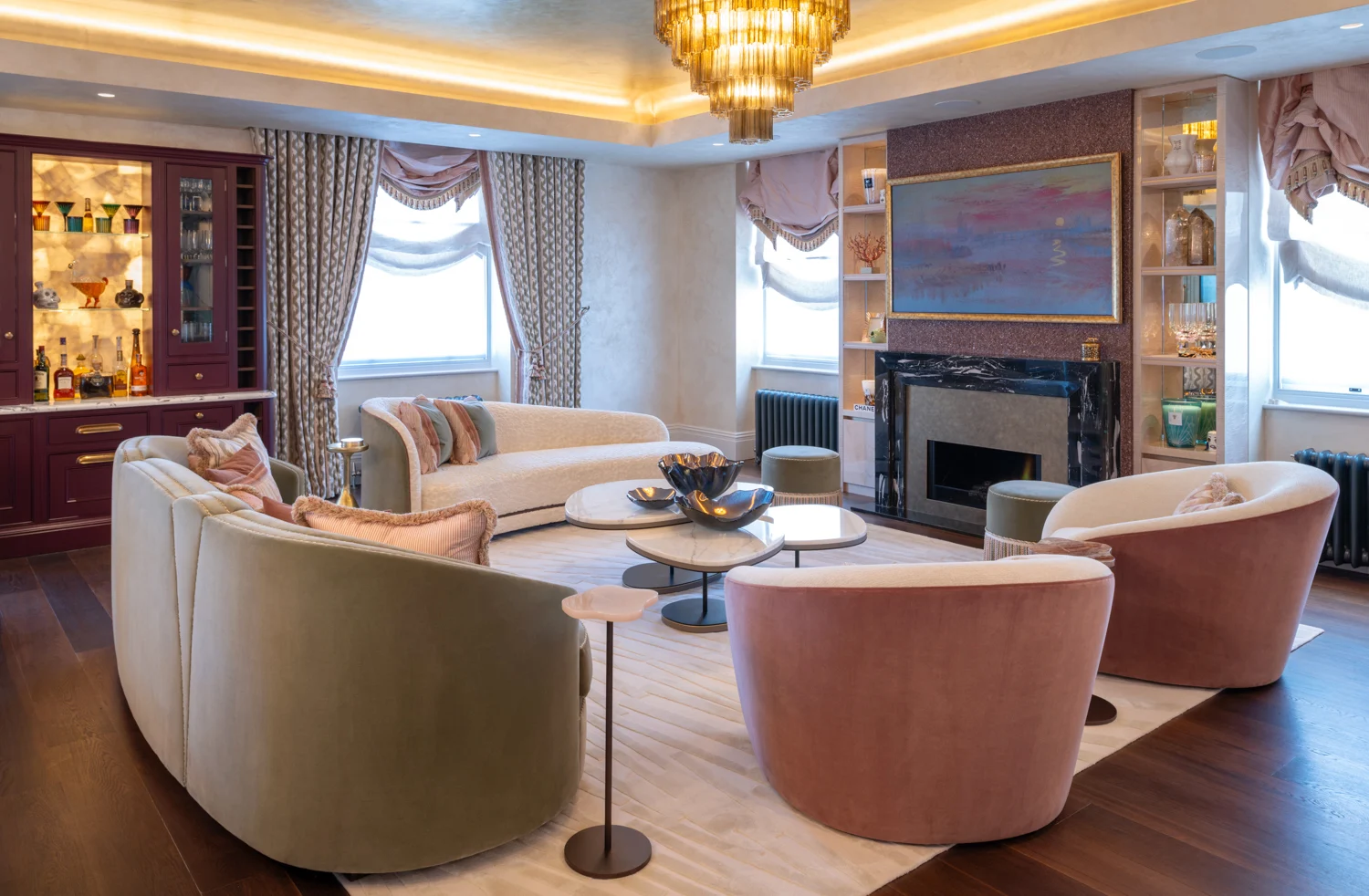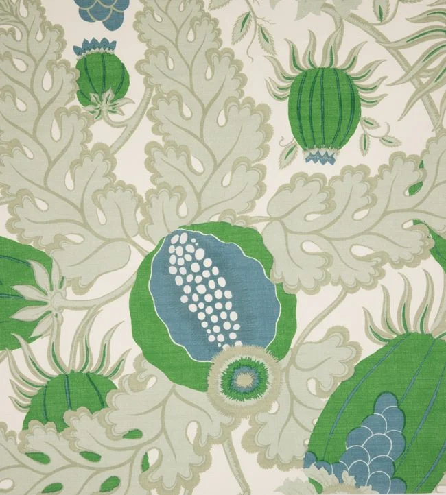
A wallcovering is rarely a background decision. It can alter the perceived proportions of a room, soften its acoustics, draw the eye towards an architectural detail or give an otherwise restrained scheme its point of view. Knowing how to choose designer wallcoverings begins with recognising this expressive role. The right design does not simply fill a wall. It establishes atmosphere, evokes emotion and gives a room a story that feels considered rather than contrived.
For a principal residence, a pied-à-terre or a hospitality setting, the most successful choice balances visual impact with how the space is genuinely lived in. A hand-drawn botanical may bring intimacy to a country house bedroom; a finely textured grasscloth can lend an urban flat the quiet depth of a tailored suit. Both can be luxurious, but only one may belong in the room before you.
Begin with the feeling, not the pattern book
Before comparing colourways or samples, define what the room needs to communicate. Designer wallcoverings offer an unusually broad vocabulary: the controlled glamour of metallic grounds, the relaxed irregularity of natural fibres, the theatre of large-scale murals and the graphic confidence of contemporary geometrics. The choice should support the emotional register of the wider interior.
Consider the room at different times of day. A dining room may benefit from a deeper, more enveloping treatment that comes alive under lamplight. A morning room or kitchen seating area often calls for something clearer and lighter, with enough visual movement to remain interesting in natural daylight. Bedrooms invite a more personal response. Here, tactile surfaces, softened palettes and designs with a sense of rhythm can make the room feel restorative without becoming bland.
This early decision also helps distinguish between a wallcovering intended to lead and one intended to support. If the scheme includes sculptural lighting, an important artwork collection or richly patterned upholstery, a subtle linen-effect, silk-effect or finely woven paper may provide necessary calm. Where furniture is clean-lined and architectural, a bolder wallcovering can introduce warmth and individuality.
How to choose designer wallcoverings for scale
Scale is where many otherwise beautiful selections falter. A sample can make a large repeat appear delicate, only for it to dominate once installed across four walls. Conversely, an intricate small-scale motif can read as visual noise in a compact room, particularly when paired with detailed joinery or heavily veined stone.
Ask to see the full repeat and, where possible, view a larger cutting or room-set image. The repeat is the vertical distance before the pattern starts again, and it affects both the visual rhythm and the quantity required for installation. A generous floral or mural-like composition needs space to breathe. It can be exceptional on the walls of a stair hall, drawing room or master suite, where its scale becomes part of the architecture. In a small cloakroom, it may be equally compelling, provided the intention is to create a jewel-box moment rather than an illusion of greater size.
Ceiling height matters as much as floor area. In rooms with low ceilings, vertical gestures, elongated leaves or discreet stripes can encourage the eye upwards. This does not mean every low room needs a stripe. A softly coloured, low-contrast design can blur the room’s edges and feel more expansive, while a dark, enveloping paper may make a modest room feel purposeful and cocooning. It depends on whether the desired effect is openness or intimacy.
Do not overlook the geometry of windows, doors, chimney breasts and alcoves. A pattern with a clear central motif may need careful positioning around these interruptions. This is not a reason to avoid it, but it is a reason to plan installation properly. The most refined interiors often rely on such precision: a motif centred above a mantelpiece, a panel aligned with a doorway, or a mural composed to frame a bed.
Read colour in the room where it will live
Wallcovering colour cannot be judged accurately under showroom lighting or on a screen. Daylight orientation, window size, surrounding buildings and the warmth of artificial lighting all change its appearance. A cool grey-green may feel serene in a south-facing room and unexpectedly austere in a north-facing one. A richly pigmented terracotta can appear beautifully earthy by day, then deepen into something more dramatic at night.
Bring a generous sample into the room and place it beside the materials that will remain: flooring, curtains, upholstery, timber finishes, stone and metalwork. View it in morning light, afternoon light and after dark. This slower process is particularly valuable with nuanced neutrals. The difference between chalk, putty, mushroom and pale olive may appear slight in isolation, yet it determines whether an interior feels coherent.
A wallcovering need not match every element. In fact, close matching can make a scheme feel flat. Instead, look for a disciplined relationship between undertones. A warm ivory wallcovering may sit elegantly alongside walnut, aged brass and tobacco linen. A cooler mineral ground can sharpen the dialogue between blackened steel, silvered oak and blue-grey velvet. Layering related tones gives a room depth without sacrificing calm.
Choose material for character and performance
The materiality of designer wallcoverings is central to their appeal. Printed papers allow for painterly detail and narrative pattern. Vinyl and contract-grade finishes can provide durability where regular use is expected. Textured grounds, from grasscloth and raffia to woven linens and pleated effects, introduce shadow, movement and a hand-crafted quality that paint cannot replicate.
Natural wallcoverings bring a particular richness, but they should be selected with informed expectations. Variations in tone, weave and fibre are often inherent to the material, rather than faults. Seams may be more visible than they would be on a printed paper, and direct sunlight can affect colour over time. In the right setting, these characteristics are precisely what create their beauty: an authenticity that feels collected, tactile and quietly luxurious.
Practicality deserves equal attention. Entrance halls, family rooms and children’s spaces may call for a wipeable or more hard-wearing finish, especially where walls are likely to encounter bags, pets or daily traffic. Bathrooms require careful specification, taking account of ventilation and whether the wallcovering will be exposed to sustained humidity. For kitchens, consider where splashes and heat occur, rather than assuming every wall needs the same treatment. A decorative paper can work beautifully in a dining alcove or breakfast area while more vulnerable zones receive a practical finish.
Build a scheme around contrast and restraint
A confident wallcovering selection is rarely made in isolation. It must converse with fabric, lighting, furniture and art. One strong pattern can carry a room, but it needs quieter surfaces around it. Equally, a textured neutral may create the ideal foundation for expressive cushions, an antique rug or a beautifully figured timber cabinet.
When combining patterns, vary their scale and character. A large, sweeping wallcovering may sit comfortably with a small geometric on an occasional chair and a plain or semi-plain curtain. Repeating a similar scale across walls, upholstery and drapery can make even a luxurious scheme feel restless. Give each material a distinct role.
The same principle applies to sheen. If a wallcovering has a metallic thread, lacquered detail or subtle reflective ground, balance it with matt plaster, bouclé, wool, timber or linen. Light will then catch the wall in a deliberate way, rather than bouncing indiscriminately around the room. Designer lighting becomes especially important here, as it can reveal the surface’s texture and tonal variation after sunset.
Plan installation before placing the order
Exceptional wallcoverings require equally considered installation. Confirm the wall dimensions, pattern repeat, matching method and roll yield before ordering. Pattern matching and unavoidable trimming around openings mean the coverage stated on a roll is not the same as usable coverage in every room. Ordering an appropriate allowance from the same batch protects the continuity of colour and finish.
Prepare the substrate with care. Walls should be smooth, dry and properly primed, particularly beneath fine papers, silk effects and natural fibres. A skilled decorator will assess whether lining paper, specialist adhesive or a particular hanging direction is required. This technical work is invisible when done well, but it is what allows the design to appear effortless.
It is also wise to decide where seams will fall before installation begins. In a guest bedroom, placing them away from the bed wall may be preferable. In a study or formal sitting room, the priority may be a perfectly centred pattern behind a desk or sofa. These are small decisions, yet they separate a merely decorated room from one that feels composed.
Give the room permission to be memorable
There is no obligation for every wallcovering to be quiet, neutral or universally agreeable. A home with lasting character usually includes moments of conviction: a corridor wrapped in an archival print, a guest cloakroom with an unexpected lacquered effect, or a bedroom lined in a textile-inspired design that feels deeply personal.
The most enduring choice is not necessarily the safest one. It is the one that honours the architecture, performs gracefully in daily life and still feels meaningful when the room is viewed in the soft light of an ordinary evening. Choose with care, specify with precision, and allow the walls to do more than decorate: let them shape the experience of home.

18th August, 2026

16th August, 2026