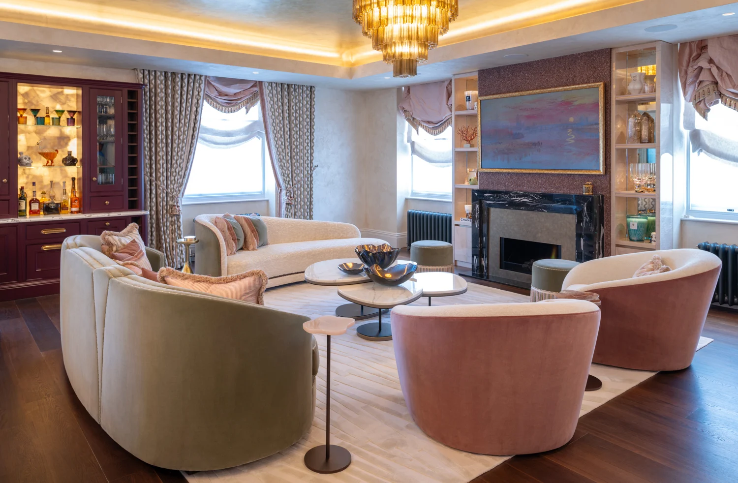
A beautifully resolved room can be diminished by a light fitting that feels merely adequate. In this Visual Comfort lighting review, we consider why the brand has become a familiar reference point for designers seeking lighting with presence, material depth and an enduring point of view – and where careful specification still matters.
Visual Comfort occupies an appealing position in the luxury lighting landscape. Its pieces are designed to be lived with rather than simply looked at: recognisable in silhouette, often generous in scale, and capable of giving a room its first note of character. From a sculptural chandelier over a dining table to a finely proportioned wall light beside a bed, the collection is particularly compelling for interiors that favour quiet confidence over novelty.
What distinguishes Visual Comfort lighting?
The strongest Visual Comfort designs begin with proportion. Many luxury fittings are decorative, but not all understand the architecture of a room. Here, the relationship between a shade, arm, stem, backplate and ceiling rose is generally considered with notable discipline. That matters because lighting is viewed from several distances: as part of the room’s composition, in passing through a corridor, and at close range when its finish and construction are most visible.
The brand’s collaborations with established names including AERIN, Kelly Wearstler and Chapman & Myers give the portfolio breadth without making it feel directionless. An AERIN piece may bring a softened, jewellery-like refinement to a dressing room or reception space. Kelly Wearstler’s more expressive forms can introduce tension and sculpture into a clean-lined interior. Chapman & Myers often lends itself naturally to classic-contemporary schemes, where a lantern or articulated wall light needs to feel established rather than period-bound.
This breadth is one of the collection’s real strengths. It can serve a pared-back city flat, a layered country house or a hospitality setting with equal credibility, provided the selection is edited with conviction. Visual Comfort is not a single aesthetic. It is a substantial design library, and the quality of the finished interior depends on choosing the right chapter.
Materials and finishes that earn their place
Visual Comfort fittings are often admired for their material language: antiqued brass, polished nickel, bronze, hand-rubbed finishes, glass, linen and natural paper shades appear across the collection. These are finishes selected to respond gently to changing daylight and candlelight, rather than sitting flatly in the room.
The best choices are those that speak to other elements in the scheme without becoming too coordinated. An aged brass wall light can draw out the warmth of timber, a gilt-framed artwork or the veining in a stone fireplace. Polished nickel can lend clarity alongside cooler marbles and lacquered joinery. Linen shades, meanwhile, soften the technical necessity of illumination with a warm, domestic glow.
There is a practical qualification. Finish samples and product imagery should be treated as a starting point, not a final decision. The apparent tone of metal is influenced by natural light, surrounding paint colour and lamp temperature. Variations can also occur between production runs, particularly where a finish is deliberately hand-applied. In a tightly detailed project, it is wise to assess the fitting alongside fabric, wallcovering and joinery samples before committing across several rooms.
Visual Comfort lighting review: performance beyond appearance
A decorative fitting is only successful if it makes a room more comfortable to use. Visual Comfort’s collection offers ample opportunity to layer light, which is the foundation of a composed interior. Pendants and chandeliers establish atmosphere and visual hierarchy; table lamps bring intimacy; sconces give a wall rhythm and reduce dependence on overhead light; picture lights add focus without theatricality.
This is especially valuable in formal reception rooms and open-plan spaces, where one central fitting rarely delivers enough flexibility. A chandelier may define the centre of a sitting room, but it should be supported by table lamps at the edges of seating, a floor lamp beside a reading chair and, where appropriate, discreet accent lighting. The result is less about brightness than control. Different pools of light allow a room to change character from morning to evening.
Many fittings are designed for dimmable use, but dimming compatibility should never be assumed. It depends on the lamp type, driver, dimmer system and local electrical specification. Decorative shades can also alter useful light output considerably. A linen-shaded table lamp is marvellous for ambience, but may not provide sufficient task light on a desk. Similarly, an impressive multi-arm chandelier may require supporting lighting if it is expected to illuminate a dining table for everyday work as well as evening entertaining.
For this reason, a lighting plan should be considered early, alongside furniture layouts and electrical positions. It is far easier to place a wall light correctly before plastering than to remedy an awkwardly positioned backplate once a room is complete.
Scale is where luxury either lands or falters
Visual Comfort is particularly effective when its scale is embraced. Many of its pendants, lanterns and chandeliers have the visual authority to anchor double-height entrances, generous dining rooms and substantial kitchen islands. In these settings, undersizing is often the greater risk. A timid fitting can make high ceilings feel emptier, not more elegant.
Yet a statement piece does not need to overwhelm. Above a dining table, the fitting should feel related to the table’s length and leave comfortable sightlines between guests. In a bedroom, bedside wall lights should align with the practical height of the mattress and headboard, not simply the centre point of the wall. In a hall, a lantern must allow sufficient clearance while still reading as a deliberate gesture from the entrance.
It depends, too, on the visual density of the room. A highly patterned fabric, antique furniture and ornate cornicing may call for a simpler silhouette in a quieter finish. Conversely, a restrained architectural envelope can accommodate a more characterful fitting. The aim is not to make every element compete. It is to give each one enough air to tell its story.
Where the investment makes most sense
Visual Comfort is not positioned as an entry-level lighting solution, and that is apparent in both its design ambition and its price. The investment is easiest to justify in spaces where lighting carries a lasting visual role: an entrance hall, dining room, principal bedroom, powder room or the central axis of an open-plan living space. These are places where a fitting shapes the experience of the home every day.
The brand is also well suited to projects that require a coherent family of fittings across rooms without descending into repetition. One may use related metal finishes or shades while varying the scale and form between a hall, landing, bedroom and bathroom. This creates continuity that is felt rather than announced.
For secondary utility spaces, or where a fitting will be concealed by cabinetry, a more economical option may be entirely sensible. Luxury is not achieved by applying the same budget to every corner. It comes from knowing where craftsmanship, visibility and emotional impact genuinely warrant attention.
There are further considerations for international projects. Dimensions, cable lengths, bulb bases, voltage and bathroom ratings must be checked against the installation country and intended location. A decorative wall light suitable for a dry bedroom may not be appropriate near a bath or basin. For clients furnishing homes across the UK, Europe, the US, the Middle East or Asia, this technical diligence protects both the aesthetic and the investment.
The final verdict
Visual Comfort’s enduring appeal lies in its ability to make decorative lighting feel architecturally relevant. The most successful pieces possess a reassuring balance of expression and restraint: they can be the room’s focal point, yet they do not demand that every other object become quieter in response.
Its collections reward a considered approach. Choose by scale, light quality and material relationship first; let the designer name or fashionable silhouette come second. A fitting that is precisely proportioned, beautifully finished and thoughtfully lit will continue to shape experiences long after the initial pleasure of a completed room has passed.

20th August, 2026

18th August, 2026