A wallcovering is rarely a background decision. It can alter the apparent proportions of a room, soften the acoustics of a formal dining space, lend intimacy to a bedroom, or give an entrance hall the sense of occasion it deserves. The most compelling designer wallcovering brands understand this emotional and architectural role, creating collections that are as considered in their materiality as they are expressive in pattern.
For a home with a distinct point of view, the question is not simply whether a paper is beautiful in isolation. It is whether its scale, palette and surface will live gracefully alongside the light, furniture, art and textiles in the room. The best choices make this complex exercise feel effortless, while retaining a depth that reveals itself over time.
What distinguishes designer wallcovering brands?
Luxury wallcoverings begin with authorship. A hand-drawn botanical, archive print, woven grasscloth or layered textile effect carries the evidence of an artistic process, rather than the flattened uniformity of a generic repeat. This is where the difference is felt: in the irregularity of a painterly line, the lustre of a silk ground, or the quiet variation within a natural fibre.
Exceptional houses also understand colour with unusual sensitivity. A neutral is not merely beige or grey; it may hold a trace of rose, tobacco, chalk or moss that changes throughout the day. Such subtleties allow a wallcovering to sit beautifully with antique timber, sculptural lighting, contemporary upholstery and collected art, rather than competing for attention.
Craftsmanship matters equally. Traditional block printing, hand-screened finishes, embroidery, raffia, linen, lacquered surfaces and dimensional weaves each bring a different form of presence to an interior. These treatments tend to be reflected in the price, as do limited production runs and specialist installation requirements. Yet they can give a room a permanence that a purely decorative surface cannot achieve.
Designer wallcovering brands for different design languages
A well-curated scheme does not require every room to speak in the same visual register. It does, however, need a coherent underlying rhythm. Choosing between designer wallcovering brands is therefore as much about the character of the house as it is about a single pattern.
Pierre Frey and GP & J Baker for heritage with vitality
For interiors that value history without feeling museum-like, Pierre Frey and GP & J Baker offer an extraordinary visual vocabulary. Their collections draw on historic documents, textiles, travel and the decorative arts, yet the colour and scale can feel remarkably current. Think exuberant florals, ikats, chinoiserie motifs and archive-inspired designs with enough confidence to anchor a drawing room or country-house bedroom.
These are papers with narrative. They work particularly well where architecture has detail to respond to – panelling, cornicing, fireplaces or generous windows – and where the furniture has equal substance. In a smaller room, a more open-ground pattern or a finely drawn print can preserve the sense of space while still delivering character.
Dedar, Rubelli and Zimmer + Rohde for refined texture
When the objective is atmosphere rather than overt pattern, Italian and European textile-led houses offer a compelling route. Dedar is admired for its cultured colour, tactile surfaces and modern restraint. Rubelli brings a rich Venetian sensibility, often balancing decorative heritage with a distinctly sophisticated finish. Zimmer + Rohde offers versatile, architectural designs that can sit comfortably within both contemporary residences and tailored hospitality settings.
Textural wallcoverings from these houses are especially effective in rooms where light is layered and considered. A woven or textile-effect surface will catch illumination differently from hour to hour, giving a calm scheme movement without visual noise. They are also an excellent answer to spaces that need warmth – a city flat reception room, a study with minimal natural light, or a bedroom intended to feel cocooning rather than simply pale.
Casamance, Romo and Black Edition for contemporary character
For a more contemporary expression, Casamance, Romo and Black Edition bring colour, geometry and artistic abstraction into the conversation. Casamance often balances modern pattern with an elegant, liveable palette. Romo is valued for its ability to create polished, versatile interiors, while Black Edition leans towards expressive painterly effects, sumptuous grounds and bolder visual gestures.
These collections can bring needed energy to clean-lined architecture, particularly where a space risks becoming overly neutral or impersonal. The key is to decide what the wallcovering is being asked to do. A large-scale abstract may become the room’s artful focal point; a tonal geometric may instead establish order and depth behind a furniture grouping.
Christopher Farr Cloth and Colefax and Fowler for an artisanal home
Christopher Farr Cloth brings an artist-led sensibility, with designs that often feel collected, handmade and quietly individual. Its wallcoverings have a natural affinity with artisanal ceramics, woven rugs, aged brass and furniture with a sculptural profile. Colefax and Fowler, by contrast, remains a reference point for English decorative elegance, with graceful florals and enduring designs that suit layered, comfortable rooms.
Both are valuable for homes that should feel personal rather than prescribed. They allow rooms to hold family pieces, contemporary art and inherited furniture together with ease. The effect is not a period recreation, but an interior with memory and warmth.
How to select the right wallcovering for a room
Start with how the room should make people feel. A guest cloakroom can tolerate drama: a saturated botanical, a mineral finish or an intricate mural may make a small footprint memorable. A principal bedroom often benefits from greater visual repose, perhaps through a softly coloured silk effect, a delicate linear pattern or a textured grasscloth.
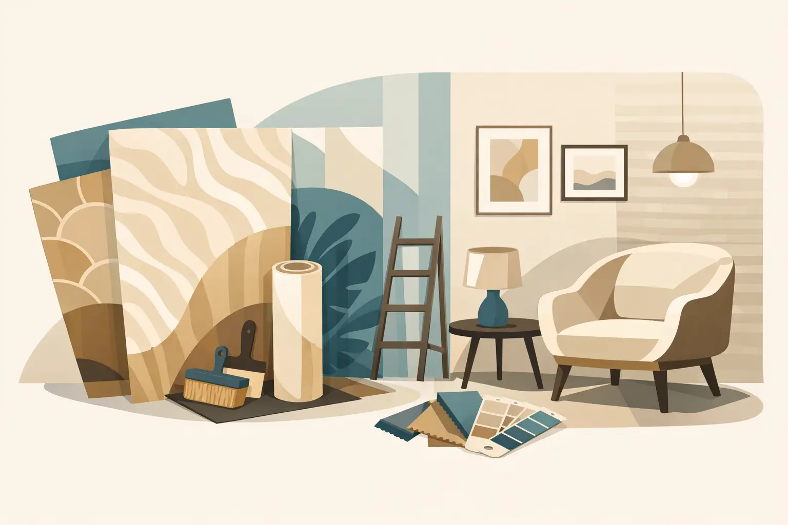
Scale should be judged from the room itself, not from a sample book. A large repeat may look formidable on a small cutting but become beautifully balanced across a generous wall. Conversely, an intricate small print can become busy if it is used across every surface in a compact room. Viewing a full repeat, or at least several lengths side by side, is far more revealing than making a decision from a single sample.
Light is the other essential consideration. North-facing rooms can make cool grounds feel steely, while strong southern light may bleach delicate tones at certain hours. Hold samples vertically, near the intended wall, and return to them in daylight and lamplight. This simple discipline prevents many expensive disappointments.
Practicality deserves equal attention. Natural fibres and hand-finished surfaces are beautiful, but may be less suitable for high-traffic family corridors, humid bathrooms or areas prone to marks. A high-performance vinyl, a wipeable non-woven paper or a protected textile finish may be a more intelligent choice in those locations. Luxury is not compromised by choosing the right specification; it is demonstrated by it.
The art of combining wallcoverings with fabrics and furnishings
A wallcovering should have a conversation with the rest of the scheme. If it carries strong colour and motif, surrounding fabrics can take their cue from one or two quieter tones within the design. If the walls are textural and tonal, upholstery, curtains or cushions have more freedom to introduce pattern.
Avoid matching every element too closely. A room becomes flatter when the wallcovering, curtains and cushions repeat the same motif at the same scale. Contrast is more enduring: a botanical wallcovering with a tailored stripe, a geometric paper with a soft bouclé, or a richly woven wall with crisp linen curtains. Repetition of colour, rather than repetition of pattern, is often what creates harmony.
Lighting has a particular role here. Wall lights and shaded lamps bring out the relief in embossed papers, metallic threads and woven surfaces, while directional picture lights can create unwanted glare on reflective finishes. A considered lighting plan should be developed alongside the wallcovering selection, not after it has been installed.
Why sampling and installation are part of the design
Even the finest wallcovering can lose its effect through poor preparation or careless hanging. Walls should be properly assessed, especially in older properties where minor imperfections, damp history or uneven plaster may affect the final result. Specialist finishes may require lining paper, a specific adhesive, careful trimming or a highly experienced decorator.
Ordering also requires precision. Allowance must be made for pattern matching, the repeat, waste, future repairs and the position of doors, windows and architectural details. For a bespoke or hand-finished design, variation between lengths is often part of its appeal, but it should be understood before installation begins.
At Tobias Oliver Interiors, the most successful wallcovering schemes begin with this level of attention: a sample viewed in context, a clear understanding of the room’s use, and a material chosen for its lasting contribution to the whole home.
Before committing, live with generous samples for a few days. Place them beside your flooring, curtains, paint and key furniture finishes, then observe what remains compelling when the room is quiet. The right wallcovering will not simply decorate the space – it will give it a more distinctive way of being.

5th September, 2026

3rd September, 2026