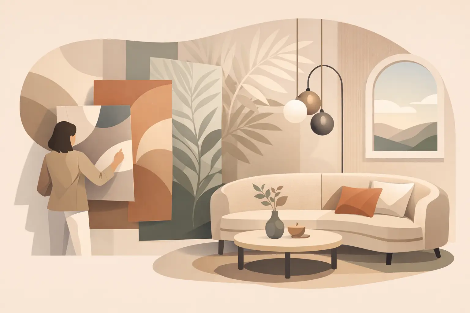
A beautifully chosen wallcovering changes more than a room’s appearance. It alters its atmosphere, softens acoustics, directs the eye and gives architecture a more personal point of view. The most compelling wallcovering trends for elegant homes are therefore moving away from novelty and towards depth: expressive surfaces with the restraint, scale and material integrity to live well over time.
For refined residential interiors, a wallcovering should not be treated as an isolated decorative gesture. It should belong to a wider composition of light, furniture, art, joinery and textiles. The aim is not simply to cover a wall, but to create a setting that evokes emotion and tells a story.
Wallcovering trends for elegant homes: a quieter confidence
The prevailing mood is considered rather than conspicuous. Homes are becoming more layered, individual and visibly lived in, yet the strongest schemes retain a disciplined sense of proportion. This has renewed interest in wallcoverings with nuance: woven grounds, hand-drawn marks, softened mineral tones and patterns whose character emerges gradually rather than announcing itself from the doorway.
This does not mean that bold pattern has disappeared. Quite the opposite. Grand-scale botanicals, graphic geometrics and mural-like scenes remain highly relevant, particularly in entrance halls, dining rooms and powder rooms. What has changed is their application. Pattern is being used with greater architectural awareness, balanced by quiet upholstery, carefully judged lighting and periods of visual rest.
Tactile wallcoverings with an artisanal hand
Texture is one of the most enduring directions in luxury interiors. Grasscloth, raffia, linen, silk, paper weave and fine textile wallcoverings bring a depth that paint rarely achieves. They respond differently to daylight and lamplight, allowing a room to feel warmer and more dimensional without relying on a busy motif.
Natural fibres also introduce the irregularity that gives a scheme credibility. Slight tonal shifts, visible joins and hand-worked variation are not imperfections to conceal; they are part of the material’s character. In a contemporary townhouse, a softly striated linen wallcovering can provide the ideal counterpart to sculptural furniture and polished plaster. In a country house, a more rustic weave can make a newly renovated room feel settled and connected to its setting.
There is a practical trade-off. Delicate fibres and silk grounds are not always suited to high-traffic family spaces, humid bathrooms or rooms exposed to strong sunlight. In these settings, high-performance vinyls and advanced non-woven designs can offer a more resilient interpretation of texture. The finish must still feel convincing at close range – an elegant home rewards materials that stand up to touch as well as distance.
Murals that create a sense of place
The return of the mural is one of the most expressive developments in wallcoverings. Rather than literal scenes chosen for instant drama, the most successful examples have an atmospheric quality: misted landscapes, abstracted gardens, architectural studies, coastal horizons or painterly washes that extend the perceived boundaries of a room.
A mural works especially well where a home needs a focal point with permanence. A dining room gains ceremony from a panoramic composition, while a bedroom can feel enveloping rather than enclosed when its walls dissolve into a tonal landscape. In a hall or stairwell, where one passes through rather than sits for long periods, there is room for a more theatrical narrative.
Scale is decisive. A small, detailed mural in a large room can appear timid and fragmented, while an overly energetic design may dominate a compact space. Consider the room from its principal vantage points, the height of the ceiling and the interruption of doors, windows and fitted cabinetry before making a selection. A mural should converse with the architecture, not compete with it.
The modern language of pattern
Pattern is becoming more tailored. There is a discernible move towards designs that reference craft, travel and art history, interpreted in a contemporary register. Block prints, ikats, stylised florals, trellis patterns and abstract geometry bring identity to a room while avoiding the generic neatness of repeated small-scale motifs.
For elegant interiors, colour is often the element that determines whether pattern feels current. Rather than stark contrast, look to complex, softened palettes: tobacco with chalk, ink with parchment, moss with stone, clay with faded rose, or aubergine with warm grey. These combinations have enough tension to be interesting, but they remain sympathetic to natural timber, antique bronze, alabaster and richly woven fabric.
A patterned wallcovering need not dictate every subsequent choice. A common mistake is to repeat every colour in its design across cushions, curtains and rugs. A more sophisticated approach is to select one or two supporting tones and allow the wallcovering to be the room’s visual anchor. Texture, rather than colour matching, can then tie the scheme together: a boucle chair, a lacquered side table, a tailored linen curtain or a hand-knotted rug.
Stripes and geometry with architectural discipline
Stripes are returning in forms that feel more architectural than nautical. Fine irregular lines can lengthen a room or lend calm rhythm to a corridor, while broader vertical bands give lower ceilings a useful sense of lift. Tonal stripes are particularly effective in bedrooms and dressing rooms, where pattern should support repose rather than demand attention.
Geometry is also evolving beyond sharp, high-contrast statements. Consider softened grids, broken checks, curved motifs and patterns with a hand-drawn edge. These designs suit homes that combine classical detailing with contemporary furniture, because they provide order without becoming overly formal.
The alignment of a stripe or geometric repeat deserves careful planning. A design that lands awkwardly at a chimney breast, window reveal or central wall can undermine even the finest material. This is an area where professional measuring, visualisation and installation make a material difference. Luxury wallcovering is an investment in craftsmanship as much as surface design.
Colour that feels collected, not prescribed
The most elegant palettes are increasingly rooted in natural pigments and aged materials. Deep olive, mineral blue, oxblood, lacquer red, tobacco, putty and burnished gold are appearing alongside the enduring appeal of chalky neutrals. These colours bring intimacy and substance, particularly in homes where the walls must hold their own against generous artwork and characterful furniture.
Dark wallcoverings deserve particular attention. A deep chocolate grasscloth or midnight botanical can be transformative in a study, library or dining room, creating a cocooning backdrop for brass, aged timber and pools of warm light. Yet darkness is not automatically synonymous with drama. In a south-facing room with abundant daylight, it can feel serene and grounding.
Conversely, pale wallcoverings are moving beyond plain beige. Oyster, mushroom, parchment, celadon and washed plaster shades offer greater complexity, especially when their surface carries a subtle weave, watermark or metallic thread. They are invaluable in open-plan spaces, where a quiet ground can unify several functions without making the interior feel anonymous.
Choosing the right room for the right expression
Wallcovering earns its place when its intensity matches how a room is used. Bedrooms benefit from enveloping texture, serene florals and low-contrast pattern. Dining rooms can carry richer colour and larger scale, particularly when evening entertaining allows the design to be revealed under layered lighting. A cloakroom is an ideal setting for a bolder print or glossy finish because its compact dimensions turn a brief visit into an experience.
In living rooms, the decision depends on the architecture and collection within it. Where art, books and objects are plentiful, a textural or gently patterned wallcovering prevents visual competition. Where the room is more minimal, a mural or graphic repeat can provide the missing point of character. There is no single correct level of decoration; the objective is a home that feels coherent, comfortable and distinctly its own.
Before committing, view a generous sample on the wall at different times of day. Hold it beside flooring, joinery finishes, curtain fabric and upholstery rather than assessing it in isolation. Observe how it changes under both natural light and the lamps that will shape the room after dark. This simple discipline often reveals whether a design is genuinely right for the space or merely attractive in a showroom.
The finest wallcoverings do not chase attention at every turn. They give a room a more assured backdrop for daily life, gathering, rest and memory – and, with thoughtful selection, become part of the home’s enduring character.

30th August, 2026

28th August, 2026