





A room can be beautifully furnished yet still feel anonymous. Often, the missing element is not another decorative object, but a fabric or wallcovering with enough character to set the emotional register. GP & J Baker offers precisely that: expressive pattern, cultivated colour and a decorative language that gives an interior a sense of inheritance without making it feel frozen in time.
For homes shaped around individuality rather than passing fashion, these collections provide more than surface interest. They create atmosphere. A sweeping botanical on linen can make a drawing room feel composed and worldly; a smaller-scale print can bring intimacy to a bedroom or library; a quietly textured wallcovering can lend depth to contemporary architecture that might otherwise feel overly spare. The art lies in choosing the right expression, in the right measure.
Why GP & J Baker still feels relevant
GP & J Baker is closely associated with the enduring appeal of British decorative arts. Its visual world is informed by archival documents, romantic florals, stylised botanicals, ornamental motifs and richly layered colour, yet the most successful applications feel remarkably current. This is because great pattern is not confined to one period. It carries memory, movement and a recognisable point of view.
In a contemporary country house, a classic floral can soften clean-lined joinery and stone floors. In a city townhouse, it can introduce warmth against plaster, bronze and dark timber. In a more traditional setting, the same fabric may sit naturally beside antiques, lacquered furniture and hand-finished trimmings. Rather than prescribing one look, it allows a room to tell a more nuanced story.
That flexibility matters for clients investing in interiors intended to mature gracefully. Decorative fabric should not be selected merely because it fills a scheme board attractively. It needs to hold its place over years of changing light, daily life and evolving collections of art and furniture. The most enduring choices have enough visual depth to reward repeated looking, while remaining calm enough to live with.
Choosing GP & J Baker fabrics with intention
The strongest rooms rarely begin with a rule. They begin with a feeling: perhaps the quiet theatre of a formal dining room, the restorative softness of a principal bedroom, or the welcoming ease of a family sitting room. Once that feeling is clear, pattern can be selected for its contribution to the whole rather than in isolation.
Start with scale, not just colour
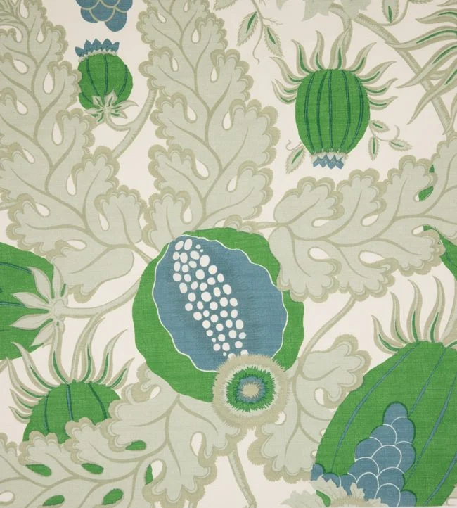
Scale is frequently the deciding factor between a print that feels perfectly placed and one that overwhelms. Large-scale motifs have presence and are particularly effective on full-length curtains, generous headboards, statement armchairs and wide expanses of wall. They need room to breathe. In a compact space, a large repeat is not automatically wrong, but it should be treated as a confident gesture rather than a tentative accent.
Smaller repeats offer a different kind of luxury. They can feel tailored, intimate and quietly detailed, especially on occasional chairs, cushions, lampshades or bedroom upholstery. They are also useful where several elements compete for attention, such as a room with significant artwork, ornate architectural details or a highly figured rug.
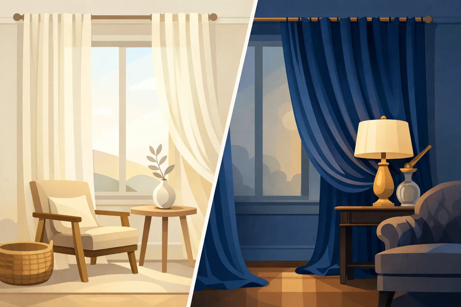
Before committing, consider the visible area rather than the size of the sample. A motif that looks delicately proportioned in the hand may become far more dramatic across six metres of drapery. Requesting a cutting and viewing it at different times of day is a practical step that often prevents costly hesitation later.
Let colour shape the mood
The colour of a GP & J Baker design is rarely incidental. Soft mineral tones can create a restrained, lived-in elegance, while saturated reds, greens, blues and golds introduce a more theatrical, enveloping mood. Neither approach is inherently more luxurious. The question is whether the palette reflects how the room is meant to be experienced.
For a restful bedroom, consider a muted ground with gentle tonal variation, complemented by deeper notes in piping, a bed valance or a silk cushion. In a dining room, a more concentrated colour can be transformative, particularly when balanced by candlelight, aged brass and a restrained table setting. Hallways and staircases can also carry bolder pattern surprisingly well. They are transitional spaces, which makes them ideal for creating a memorable first impression without asking a single room to do all the decorative work.
A useful approach is to identify one colour from the design that can recur elsewhere in the scheme. It may appear in a painted finish, a rug border, a ceramic lamp or a passementerie detail. Repetition gives a room cohesion, but it need not be literal. A close tonal relationship often looks more considered than an exact match.
Balance ornament with restraint
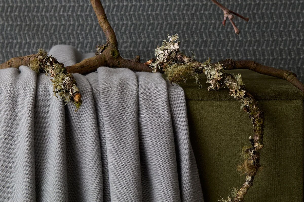
Patterned fabric is most convincing when it is given contrast. Pairing an ornate print with plain linen, velvet, wool or a textural weave allows its detail to register. The reverse is equally true: a pared-back room can benefit from one decorative gesture that brings softness and cultural depth.
This does not mean every scheme requires a feature print. Some rooms are better served by texture, especially where the architecture is already expressive or the view beyond the window is the focal point. A refined interior depends on proportion. If the curtains, upholstery, walls, rug and cushions all announce themselves at once, the room can lose its sense of calm.
Consider assigning a hierarchy. One fabric may lead on curtains or a statement sofa, while supporting textiles provide tonal and tactile counterpoint. A contrasting trim can define the silhouette of a chair or cushion without introducing another full pattern. These quieter layers are often what make a richly decorated room feel resolved rather than busy.
GP & J Baker wallcoverings as architectural decoration
Wallcovering changes the perceived character of a room more completely than almost any other finish. It affects every sightline, softens acoustics and creates a backdrop for furniture, art and lighting. GP & J Baker wallcoverings are particularly compelling where a room needs atmosphere from the moment the door opens.
In a formal drawing room or dining space, an expansive botanical or archive-inspired design can establish a decorative framework around which the rest of the room is composed. In bedrooms, a calmer pattern behind the bed may create a cocooning quality without the visual weight of upholstered walls. For cloakrooms, dressing rooms and smaller entrance halls, bolder papers can offer a moment of delight and a welcome departure from caution.
There is, however, a practical consideration. Strongly patterned walls ask for disciplined furnishing. They pair beautifully with plain upholstery, sculptural lighting and furniture with clear silhouettes. If the room already contains patterned curtains or a prominent antique carpet, a more textural or small-scale wallcovering may be the more intelligent choice.
Installation deserves equal care. Pattern matching, the placement of a repeat around fireplaces and windows, and the treatment of awkward corners all influence the final effect. In a high-value scheme, the paper should be planned alongside joinery, curtain placement and lighting positions, not added once every other decision has been made.
Where these designs work best
There is no single GP & J Baker room, but certain applications consistently reveal the collections at their best. Curtains allow large motifs to unfold vertically and give a room movement. Upholstery makes the pattern tactile and personal, particularly on a chair designed to be admired from every angle. Wallcovering creates immersion, while cushions and decorative details offer a lower-commitment way to introduce colour or revive a more neutral setting.
For a principal room, it can be worth using the fabric in a more substantial way rather than scattering it across too many small accessories. A single pair of beautifully made curtains or a deeply upholstered chaise in a memorable print will have more authority than a series of tentative decorative gestures.
In high-use family spaces, performance requirements should guide the final specification. Consider how a fabric will wear, whether sunlight is intense, how often upholstery will be used and whether there are children or pets in the household. The most beautiful design is only successful when it supports the way a home is actually lived in. A decorative cushion may suit a delicate textile; a frequently used sofa may call for a more resilient coordinating fabric instead.
A considered way to build a scheme
Begin with the room’s architectural strengths, its natural light and the furniture that must remain. Then select the leading GP & J Baker element and develop the supporting palette around it. This might mean drawing out the warmth of an aged-ivory ground, echoing a leaf green in painted cabinetry, or introducing a dusky blue through silk shades and a hand-knotted rug.
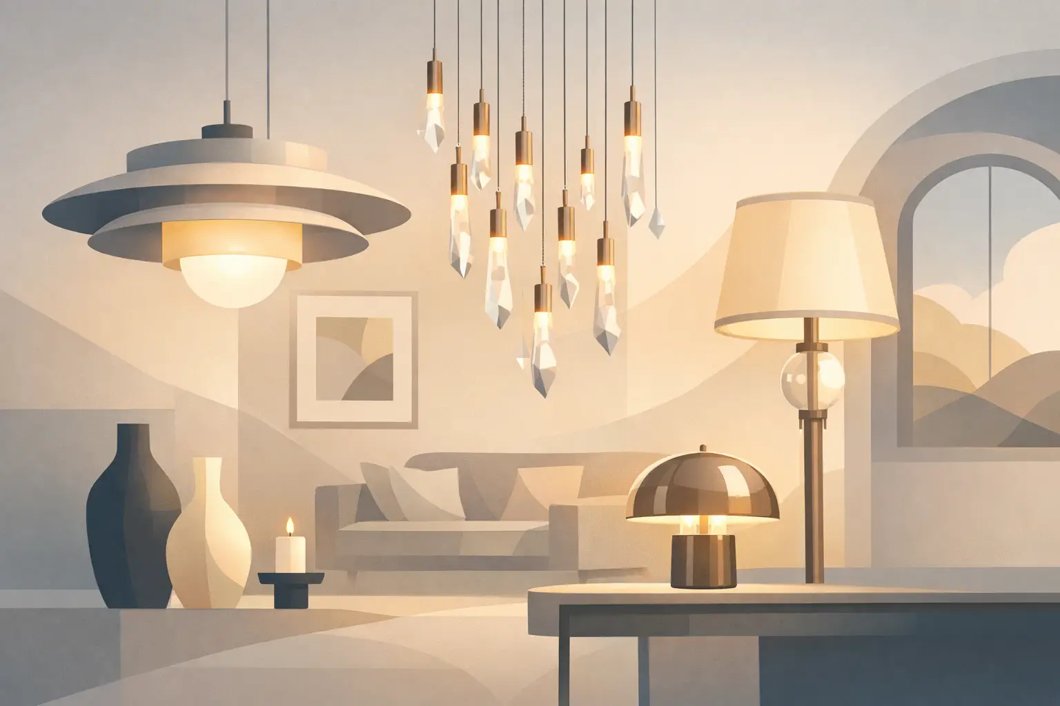
Materiality is essential. Pattern feels richer when surrounded by tactile contrasts: timber with visible grain, antique brass, plaster, stone, boucle, leather or a finely woven plain. Lighting should be considered early too. The right lamp glow reveals the depth of colour at night, when fabrics and wallcoverings often become even more atmospheric.
At Tobias Oliver Interiors, such choices are approached as part of a complete decorative composition, not as isolated purchases. This matters when fabric must relate to custom upholstery, window treatments, furniture proportions and the changing rhythm of a home.
Choose the design that continues to move you after the initial excitement has passed. That is usually the one with the depth to live beside you, shape daily experience and become part of the story your home tells.

22nd July, 2026

21st July, 2026