





A fabric scheme is often decided long before the final cushion is placed. It begins with the hand of a cloth, the restraint or confidence of its colour, and the way it responds to changing light. Romo fabrics are valued for precisely this balance: they bring a considered design language to interiors while remaining highly liveable, whether chosen for a formal drawing room, a quietly luxurious bedroom or a contemporary country house.
For discerning homes, fabric should do more than fill a surface. It should shape experiences, soften architecture and create a visual rhythm between furniture, wallcoverings, lighting and art. The strongest Romo schemes feel composed rather than decorated – personal, layered and built to endure beyond a passing trend.
What defines Romo fabrics?
Romo occupies a distinctive place within the world of decorative textiles. Its collections are recognised for sophisticated colour, expressive pattern and an approachable sense of modern luxury. There is a breadth to the offering, from understated linens and textural plains to graphic geometrics, botanical prints, velvets and considered sheers. This allows a room to be developed with continuity rather than relying on a single statement fabric to carry the whole scheme.
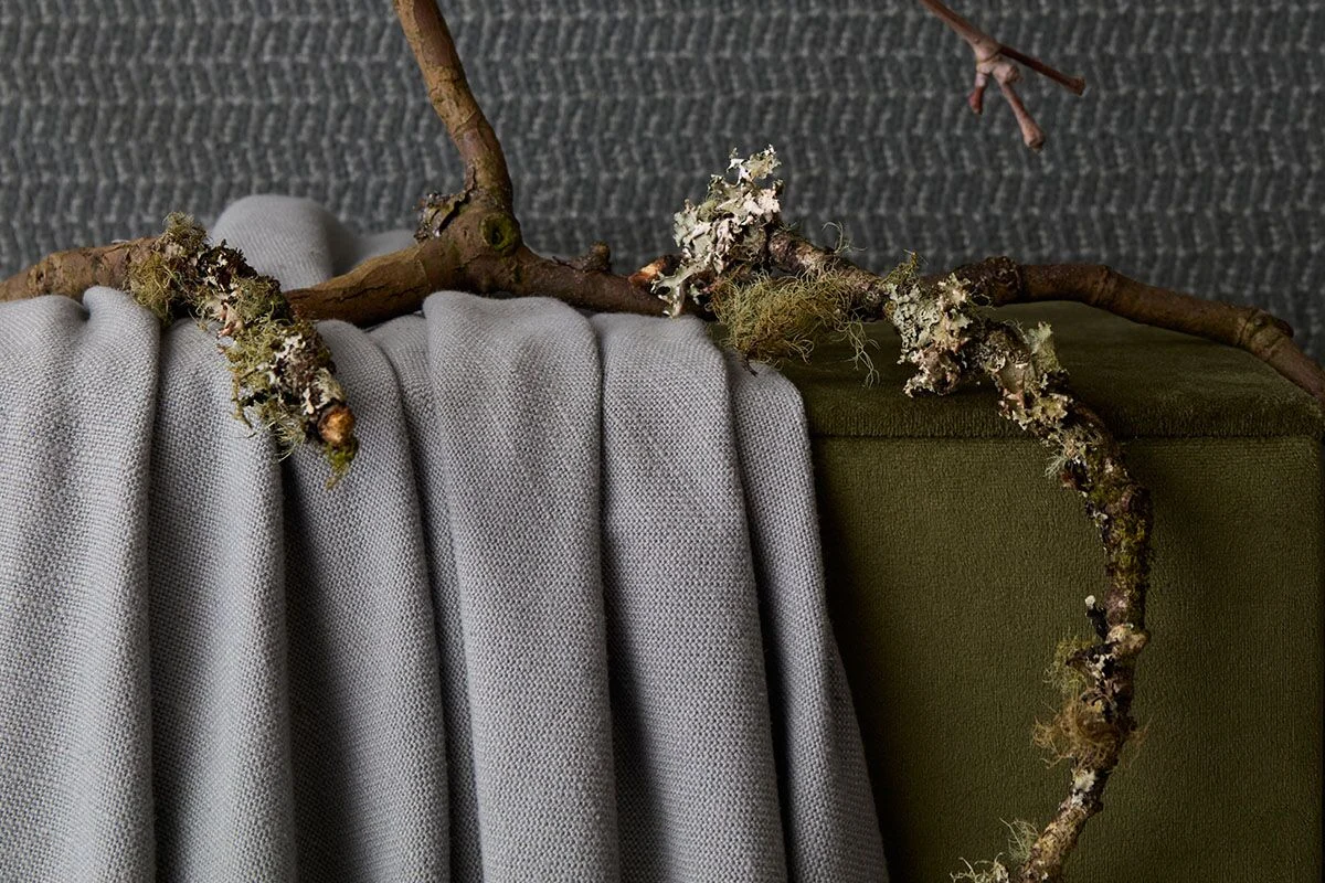
Colour is central to the appeal. Rather than appearing simply neutral or bright, many Romo palettes have a softened complexity: mineral greys, chalky whites, mossy greens, inky blues, ochres and nuanced pinks that shift gently across the day. Such tones can make a room feel settled and richly composed, particularly when repeated in different scales and textures.
The collections also understand that contemporary interiors need warmth. A clean-lined sofa gains presence in a generous velvet; tailored curtains become more architectural in a dry, woven linen; a small-scale patterned chair can bring life to a restrained room without disturbing its calm. This is where fabric becomes an instrument of proportion, not merely a finishing detail.
Choosing Romo fabrics by room and function
The most successful selection starts with how a space is used. A fabric that looks exquisite on a sample hanger may not be the right answer for a family sitting room, a sun-filled conservatory or a guest bedroom used only occasionally. Performance, drape, pattern scale and maintenance need to sit alongside aesthetic instinct.
Living rooms: build depth before pattern
In a principal living room, begin with the largest upholstered piece. A sofa in a tactile plain, woven texture or forgiving velvet provides a calm foundation and gives greater freedom elsewhere. The fabric does not need to be pale to feel refined. Mid-tones such as tobacco, olive, slate or warm stone are often more accommodating in daily life, while still lending an elevated, tailored quality.
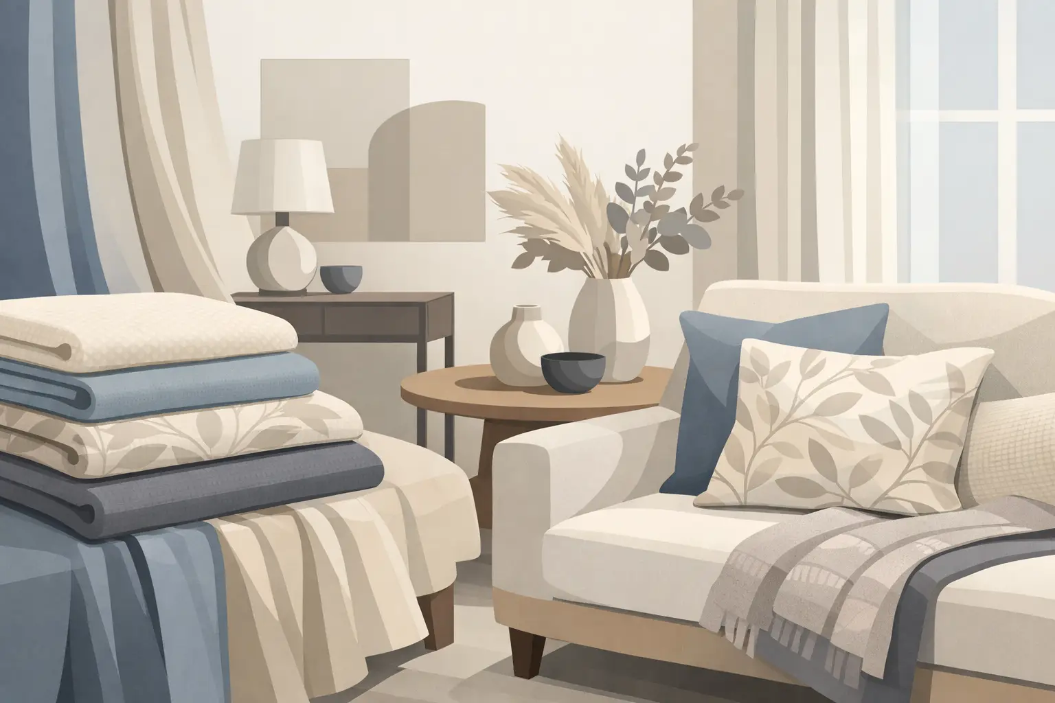
Once the anchor upholstery is established, introduce a pattern through occasional chairs, cushions or an ottoman. This is often the more enduring approach than covering every major item in a decorative print. A large motif can be magnificent in a generous room with space to appreciate it; in a compact London flat, it may be better reserved for a single chair or window seat.
Consider the room from a distance as well as at close quarters. Texture creates depth when viewed across the room, while a pattern reveals its character as one approaches. Combining both produces an interior that continues to reward attention.
Bedrooms: favour touch, quiet and softness
Bedrooms invite a more intimate response. Here, Romo fabrics can be used to create a hushed backdrop through upholstered headboards, bed valances, curtains and cushions. Soft linens, brushed weaves and gentle jacquards bring a tactile richness that feels appropriate to the room’s private nature.
Curtains deserve particular attention. The right cloth can frame a view, moderate light and give the bedroom a sense of generous proportion. However, a beautiful decorative fabric is not automatically suitable for full-length drapery. Check its weight, width, recommended use and whether it requires lining or interlining to achieve the desired fullness and insulation. A delicate sheer may offer atmosphere, but it will not provide the darkness required by every sleeper.
For a more layered result, pair an upholstered headboard in a quiet texture with a patterned bench or a pair of cushions in a deeper tone. The effect is composed and inviting without becoming overly coordinated.
Dining rooms and studies: use character with discipline
Dining rooms can accommodate more decorative confidence, especially where evening lighting allows colour and pattern to become part of the atmosphere. Upholstered dining chairs in a tailored geometric or a small-scale repeat offer a sophisticated alternative to plain timber seating. Yet durability matters: dining chairs experience regular contact, movement and the occasional spill, so suitability for upholstery and cleaning guidance should inform the final decision.
In a study, fabric can soften the hard lines of joinery and technology. A Roman blind in a textured weave, an accent chair in a rich velvet, or fabric-backed panels within cabinetry can alter the mood of the room entirely. The aim is not to make a study precious, but to make it a place where concentration feels supported by comfort and visual calm.
Scale, colour and the art of combining patterns
The question is rarely whether patterns can be mixed. It is whether they are being mixed with enough contrast and enough restraint. A confident fabric scheme normally varies at least two of the following: scale, density, ground colour or texture.
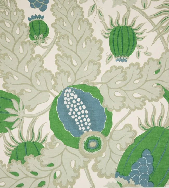
For example, a broad botanical print might sit beautifully with a fine stripe and a plain bouclé, because each element performs a different role. Two similarly scaled, busy patterns in competing colours can make even an expansive room feel unsettled. The answer is not to avoid pattern, but to give each fabric space to speak.
A useful approach is to identify one lead fabric that sets the emotional direction of the room. It may be a floral with faded pigments, a modern abstract, or a richly coloured velvet. Select supporting fabrics from its quieter notes rather than matching the most obvious shade. Picking up the softest clay, olive or blue-grey within the design usually creates a more nuanced result than repeating its strongest colour everywhere.
Samples should be viewed where they will live, not only under showroom lighting. Place them against flooring, paintwork and existing furniture; view them in morning light, at dusk and under lamplight. Fabric is inherently responsive. What reads as a warm neutral in one setting may take on a green, pink or grey cast in another.
Practical considerations that protect the investment
Luxury is most convincing when it is well specified. Before committing to Romo fabrics, confirm the intended end use, rub test or durability information where relevant, composition, care instructions, pattern repeat and fabric width. These details affect both longevity and cost, particularly for curtains, where repeat and drop calculations can materially alter the quantity required.
Natural fibres bring a beautiful irregularity and hand, but they may crease, fade or wear differently from high-performance blends. This is not a flaw; it is a choice to make knowingly. A pure linen in a peaceful guest room may be entirely appropriate, while a busy household with children, pets or frequent entertaining may benefit from a more resilient upholstery option in its hardest-working spaces.
Window treatments require their own consideration. South-facing rooms can be demanding on colour, and direct sun may gradually affect even quality textiles. Lining, interlining, careful placement and appropriate window shading can preserve the fabric’s appearance while improving comfort within the room.
Designing a scheme with lasting relevance
The most memorable interiors do not rely on every piece being new or overtly dramatic. They rely on relationships: the conversation between a velvet chair and a painted wall, a quiet curtain against sculptural lighting, a patterned cushion that echoes a work of art. Romo fabrics offer enough range to make these relationships feel intentional, whether the setting is classically detailed or architecturally minimal.
At Tobias Oliver Interiors, fabric selection is considered as part of the wider composition, not as an isolated purchase. This is especially valuable when balancing existing heirlooms with contemporary furniture, or when creating continuity across several rooms. A well-chosen cloth can connect these elements with a lightness that paint alone cannot achieve.
Begin with the feeling you want the room to hold – restorative, sociable, tailored or expressive – then allow texture, colour and function to refine the choice. The right fabric will not simply complete the scheme. It will give the room its lasting emotional register.

23rd July, 2026

22nd July, 2026