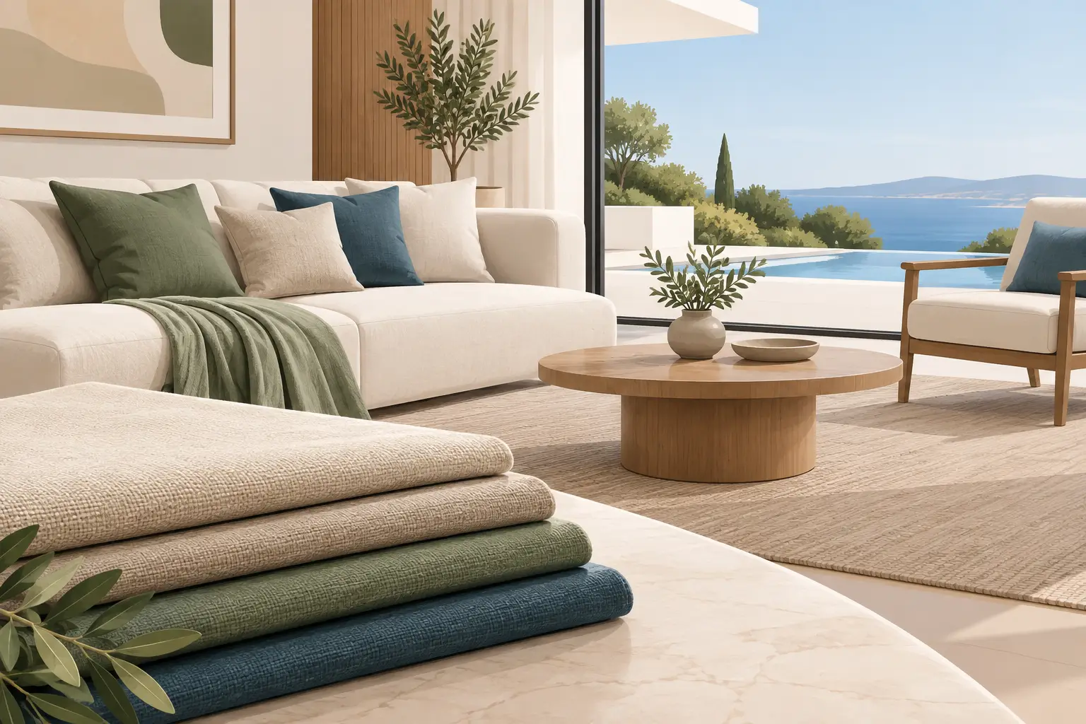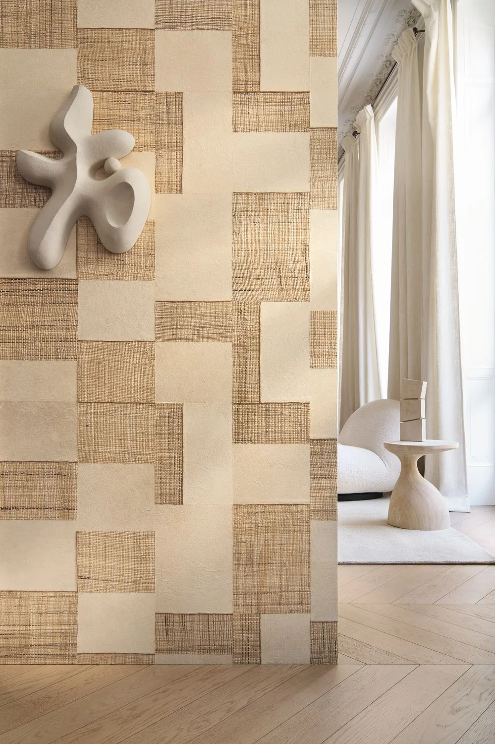
A room can have beautiful proportions, considered furniture and exceptional lighting, yet still feel slightly incomplete. Often, the missing ingredient is not another object but a more expressive surface. Textured wallcoverings introduce depth, warmth and a tactile quality that paint alone rarely achieves, changing not only how a room looks but how it is experienced.
For refined interiors, texture is rarely about making a loud statement. It is about creating atmosphere: the soft irregularity of grasscloth, the tailored richness of linen, the architectural presence of embossed paper or the subtle luminosity of a woven metallic. These materials catch daylight, respond to lamplight and lend walls the same considered character as finely upholstered furniture or hand-finished joinery.
Why textured wallcoverings feel so considered
Texture gives a wall visual weight without relying on high contrast or overt pattern. This makes it especially valuable in schemes where the palette is restrained – warm whites, mineral greys, tobacco, stone, olive or inky blue. A textured surface allows these quieter colours to retain complexity, so a room feels layered rather than flat.
There is also an emotional dimension. Natural fibres, paper weaves and textile-effect finishes make a space feel more intimate because they recall materials we instinctively associate with craftsmanship and comfort. In a large reception room, they can temper formality. In a bedroom, they bring a cocooning quality that still feels composed. In a contemporary new-build, they can counterbalance hard architectural lines and give the interior a more settled, individual identity.
The effect changes throughout the day. A low winter sun may reveal the horizontal weave of a grasscloth; by evening, a pair of well-positioned wall lights can draw out a gentle shimmer or raised relief. This interplay is precisely why samples should never be assessed under one overhead light in a showroom or on a screen alone.
Choosing texture for the architecture, not the trend
The most successful choice begins with the room itself. Consider its scale, aspect, ceiling height and the materials already present. A woven wallcovering with a pronounced horizontal line can visually widen a narrow sitting room, while a vertical texture can give a lower-ceilinged space a more elongated, elegant impression. In a period property, hand-crafted papers and irregular natural fibres can sit beautifully alongside original cornicing and timber. In a pared-back contemporary interior, a finely embossed or softly metallic design may offer a cleaner, more tailored result.
Texture should also relate to the furnishings. A room containing bouclé upholstery, wool rugs, pleated shades and timber furniture already has considerable tactility. The wallcovering may therefore need to be quieter – a fine linen-look finish or lightly mottled plaster effect rather than a heavily dimensional weave. Conversely, a room furnished with sleek lacquer, stone and polished metal may benefit from a more visibly tactile wall to restore warmth and balance.
Colour is inseparable from this decision. Deep shades gain remarkable nuance when they are woven, crushed, grassed or embossed, but they absorb light more readily. In a naturally dark hall or north-facing study, choose a ground with a softly reflective thread, an open weave or a lighter tonal variation. A dark textured paper can be deeply sophisticated, but it needs enough light – natural or artificial – to reveal its character.
Natural fibres and grasscloth
Grasscloth, raffia, sisal and similar natural wallcoverings bring an artisanal quality that is difficult to imitate. Their charm lies partly in their variation: seams can be visible, colour may shift gently from one length to the next, and the weave will never be mechanically uniform. These are not flaws. They are evidence of the material’s origin and should be embraced as part of the finished composition.
They are particularly effective in studies, dining rooms, bedrooms and drawing rooms where the aim is warmth and quiet distinction. However, natural fibres are less forgiving in areas exposed to splashes, steam or frequent handling. They may not be the right choice behind a busy kitchen breakfast area or in a family entrance where coats, bags and paws regularly meet the wall.
Textile-effect and fabric-backed finishes
For the softness of fabric with greater practicality, textile-effect wallcoverings offer a compelling middle ground. Some have the refined appearance of linen, silk, wool or suede, while others are genuinely fabric-backed. They work beautifully where acoustics matter, such as media rooms, libraries and bedrooms, because visually they soften the envelope of the room.
Performance varies considerably, so specification matters. A delicate silk finish may be ideal for a formal guest room, while a more durable vinyl or contract-grade interpretation can suit a boutique hospitality setting, a lift lobby or a high-traffic corridor. Luxury is not compromised by practicality when the finish has been chosen with care.
Embossed, sculptural and metallic papers
Embossed wallcoverings create shadow as well as texture. Fine geometric relief, plaster-like finishes and sculptural patterns can give a wall architectural presence without introducing another building material. They are particularly effective on a single elevation behind a bed, dining table or entrance console, where raking light can articulate the surface.
Metallic textures require restraint. A muted antique bronze, pewter, champagne or mica finish can add depth to a room at dusk, particularly when paired with warm lighting and natural timbers. Highly reflective finishes can feel theatrical in the right setting, but they reveal imperfections and can overwhelm a small room if used on every surface. A little lustre often carries further than an entire room of shine.
Where texture earns its place
Textured wallcoverings do not need to be reserved for feature walls. Used across all four walls, a subtle design can create a calm, enveloping backdrop and allow art, furniture and lighting to take focus. This approach is especially persuasive in bedrooms, studies and sitting rooms where comfort is central to the brief.
A feature wall is most convincing when it has a clear architectural purpose. Behind a headboard, it frames the bed and intensifies the sense of sanctuary. In a dining room, it can anchor a sideboard or artwork. Within a hallway, it can establish a memorable first impression before the home opens into quieter rooms. Applying texture to an arbitrary wall simply because it is empty usually produces a less resolved result.
Ceilings deserve consideration too. A delicate woven or linen-effect covering can make a dining room feel more intimate, particularly in properties with generous ceiling heights. The ceiling should not compete with a decorative floor, ornate lighting and patterned curtains all at once; it is most successful when it supports a measured, cohesive scheme.
Light, scale and the sample test
Order generous samples where possible, and view them vertically rather than flat on a table. Tape them to the intended wall and look at them in morning light, late afternoon and after dark with the proposed lamps switched on. Move a sample beside curtain fabric, upholstery, flooring and paintwork. Texture alters perception: a warm grey may read cooler against oak, while a beige grasscloth may reveal a green or gold undertone beside limestone.
For larger rooms, a small cutting can be misleading. Repeat, seam placement and directional weave become more apparent at scale. It is worth requesting a room visual or discussing the design with an experienced interiors professional before ordering, particularly for a paper with panel effects, a strong relief or natural variations.
Installation is part of the design
Even the most exceptional wallcovering cannot compensate for poor preparation. Walls should be dry, sound, smooth and properly lined where required. Existing hairline cracks, uneven plaster and old adhesive residue may become more noticeable beneath a textured or reflective finish, rather than disappearing.
Natural and hand-crafted materials demand a skilled decorator who understands their particular characteristics. They must check lengths before hanging, manage shading thoughtfully and plan seams around focal points, windows and joinery. Do not assume a natural wallcovering will match exactly from one roll to another. Ordering sufficient material from the same batch, with an allowance for cuts and future repairs, is sensible protection for an investment finish.
In kitchens, cloakrooms and family homes, ask early about cleanability, moisture resistance and durability. A wallcovering can be exquisite and still be unsuitable for its proposed location. The right specification respects how a household actually lives, not just how it wishes to be photographed.
Building a scheme with lasting depth
Texture becomes most compelling when it is repeated with variation. A fine woven wallcovering might sit beside a boucle chair, a patinated bronze lamp and a silk-wool rug, each material bringing a different scale of tactility. The aim is not to make every surface busy, but to create a dialogue between matte and lustrous, smooth and irregular, tailored and tactile.
At Tobias Oliver Interiors, this is where a curated approach has real value: matching the mood of a wallcovering to the furniture, lighting and textiles around it, rather than treating it as an isolated finish. The result is an interior that feels collected and assured rather than decorated in a single gesture.
Choose the wallcovering that continues to reward attention after the first impression has passed. When its texture shifts gently with the light, supports the architecture and feels right to the touch, it will shape the atmosphere of the room for years to come. https://www.tobiasoliverinteriors.com/product/casamance-takumi-wallpaper/?variant=58047734022526

23rd September, 2026

21st September, 2026